 FA+
FA+
550
Views
Views
8
Favorites
Favorites
Category
All / All
Species Vulpine (Other)
Size 1280 x 600
File Size 363.7 kB
Report this content
More from foxfencer


Listed in Folders


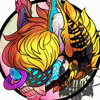
Just tried sketching and inking directly digitally; this was the outcome.
I know there are things wrong, but I'm trying to evolve my art to eventually no longer need paper to draw on.
Critique would be most appreciated.
I know there are things wrong, but I'm trying to evolve my art to eventually no longer need paper to draw on.
Critique would be most appreciated.
Category All / All
Species Vulpine (Other)
Size 1280 x 600px
File Size 363.7 kB
Listed in Folders
dude this is awesome ^^
you want a critique.
well for your first time sketching and inking, beautiful job. the lines could be neater but its your first time.
secondly, try founding out what pen size is right for you and your style. that might help.
finally, practice always makes perfect! even im trying to learn and helping you out at the same time lol
i hope this helps ^^
the one on the left's right hand's index finger... o.o looks WAAAAY too short. like it has one digit instead of three.
one on the right looks kinda awkward with head size and neck kinda... looking weird, maybe too short, i dunno.
the lines look a lot neater than i could make it now ^^; i personally appreciate the left pic a LOT more, the eyes and eye contact are a big big factor with me, and i feel those beauties coming out at me. The other thing that's important is the background. Gradients and abstract backgrounds get misplaced and awkward at times. Putting your characters on ground or with an actual sky in the background.
D: i'm sorry, you're a really good artist and i don't wanna be mean because i can't do better, but critique is critique.
Comments