 FA+
FA+
149
Views
Views
32
Favorites
Favorites
Category
Artwork (Traditional) / Animal related (non-anthro)
Species Opossum
Size 1050 x 1050
File Size 1.19 MB
Report this content
More from groundpear


Listed in Folders


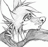
After some talks with BeoWoof in the comments here ( https://www.furaffinity.net/view/63550155/ ), I decided to try to draw some sketches in common printing paper, with more trivial pens and pencils. The results are not the same of a sturdier paper and softer pencils, of course; the work with layers is more limited, and the colors more diffuse. But it is still possible to do nice gradients! And results can be very pleasant, if you consider the strong and weak points of the materials, plan accordingly, and take advantage of those more atmospheric effects!
Do you want to see WIPs of this project? All supporters, monthly or one-off, can see them in the folder "A taste of the coffee!" https://ko-fi.com/album/A-taste-of-.....fee-P5P712MNUN
Do you want to have early access to the complete page with more drawings? Join the tier "Coffee in That Nebula!" https://ko-fi.com/ratgroundpear/tiers
ID: Furry portrait of an opossum, smiling in profile. The photo also shows a pen and some colored pencils used to do the drawing. End ID.
Category Artwork (Traditional) / Animal related (non-anthro)
Species Opossum
Size 1050 x 1050px
File Size 1.19 MB
Listed in Folders

Love this exploration on different material. I remember back when I started, how much it always frustrated me that I could not achieve certain looks with coloured pencils like I saw other people do before it dawned on me that most of the time, what kinda abuse a paper can take makes a world of difference.
Though, I learned also early on that even the cheapest coloured pencils can also be worked well on printer paper when used in tandem with alcoholic markers or baby oil. The effects you can pull with mixing some stuff certainly changes a lot as well.
Either way it looks dope and soft and lovely but I am not surprised because you did it so of course this looks amazing as always.
Aaaawww, thanks for the kind comment!
The combo printer paper/markers, at least with materials available here, still makes me feel a bit... odd? Printing papers here are really light (around 75g/m²) and maybe the fibers are particularly short or thin.
But we all try our best with the resources we have! I still need to try some washi tapes...
Again, thanks for the kind comment. It makes me melt (affectionate) even more, coming for such a seasoned, competent traditional mixed media artist like you!
Oh wow you actually tried it?! Now you felt my same pain xD
That's amazing to think I was able to inspire this creation, and dang you are right. Compared to your prior colored traditional artworks on dedicated sketch paper, this one on print paper does not quite have the same depth and richness of color [not to say it isn't lovely in it's own way because everything you create is!]. Layering is difficult right? Huh, so maybe the fix to my struggle was the paper all along.
That's amazing to think I was able to inspire this creation, and dang you are right. Compared to your prior colored traditional artworks on dedicated sketch paper, this one on print paper does not quite have the same depth and richness of color [not to say it isn't lovely in it's own way because everything you create is!]. Layering is difficult right? Huh, so maybe the fix to my struggle was the paper all along.
Haha, yeah, I did! I still need to upload the other sketches - in one I tried to add more layers and, although the end result was nice, I do prefer to keep things lighter in light paper.
Again, you can change paper and pencils, or maybe readjust expectations and make your best with printing paper. If you focus on good planning about colors, more modest layering and simple gradients, it can work nicely
Also check HavetheTouch's comment above + gallery - lots of good experimental ideas for traditional art!
Again, you can change paper and pencils, or maybe readjust expectations and make your best with printing paper. If you focus on good planning about colors, more modest layering and simple gradients, it can work nicely
Also check
HavetheTouch's comment above + gallery - lots of good experimental ideas for traditional art!
I also bet it looks more colorful in person than it does in this picture you took. I'm always having to tweak the saturation setting to make it look closer to what it does in person.
Readjusting expectations is what I will do first, that will take alot of stress over wondering why I can't get richness and depth like other traditional artists do. I like your way of tackling it, using the right materials based on what your expectations are. This would work ok if the expected result is light, sunny colors, and using prisma and sketch paper when you expect to make something dark and bold like a night setting or need to work with layers.
Oh wow, I could get lost in that gallery!
Comments