 FA+
FA+
625
Views
Views
26
Favorites
Favorites
Category
All / All
Species Mouse
Size 1000 x 1000
File Size 584.7 kB
Report this content
More from Desert-Mouse


")


Listed in Folders


Category All / All
Species Mouse
Size 1000 x 1000px
File Size 584.7 kB
Listed in Folders


I know people don't really like critique but I'm going to go for it anyway. I'm not really an artist myself but I do enjoy other people's art. That is mind please take everything I say as coming from a non-professional and someone who just likes art.
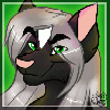
Interesting art is often good art. The first thing that pops out is that this is a great idea. The arena, the Romanesque sword, the anthropomorphic mouse, and the vaguely Asian stance make the depicted situation more complex. multi-faceted art is more interesting.
More could be done with the minimalist background. I think the choice to make it minimalistic was a good one. Having a background in first place was also a very good decision because it helped frame the character. The sharpness of the character however makes the background feel sloppy. Cleaning up the lines of the background to make it more uniform could have strengthened the image of the character. Badass poses go well with badass locations.
I don't know if this is a pre-established character but I will say that I noticed one artistic choice that doesn't make a lot of sense to me and several good choices. Starting with the good stuff I very much like the choice is made on the sword. I wonder if it was a conscious choice to make the blade of the sword the same color palette as the whites of the character's eyes, or the grip of the sword a sharp blue? Connecting the sword's blade to the character's eyes was an cool choice because it helps make the character's expression feel more dangerous. The mouse doesn't just have a sword, the mouse wants you to know he has a sword. The blue on the handle is a nice way to sneak a little color variety onto a character without overwhelming the earthy tones. Speaking of earthy tones the bandana was implemented quite excellently it helps shape the characters face and goes well with his pose, but I particularly like the choice of a dark green color going with the earth pallet of the character. Now to my one objection in this regard that shirt. There's nothing wrong with the shape of the shirt per se it just falls quite short of the bandana. Perhaps if there'd been a fold at the edges of the chest and arms thickening the fabric there and making it look a little bit more interesting. The bigger problem with the shirt is that its color set is... well ugly. I'm sorry, directionless brown lines with green splotches on an off white shirt is the kind of thing you put on because you're half-asleep and don't care. Everything else about the image: location, expression, body language, the tools and accessories all look very deliberate on the part of the character. A simple change of the shirt's colors to the same green as the headband would improve the character's look. Uniforms are so universally strong that we literally have an expression "I love a man in uniform" which has stood the test of the changing times to now include the phrase "I love a woman in uniform". The setting being an arena it would also make sense for the character to be careful with wardrobe choices. If you're going to be in front of alot of people, you owe it to yourself, and to them, to look your best. So for a character that looks like they know what they're doing and are being very deliberate it's odd that they didn't pay attention to what they were wearing.
Anyway that's my two cents. Thank you for sharing such a fun image and keep excelling. :)

Samurai: https://www.youtube.com/watch?v=wDnAVEQDXHc (also in german, too)
Comments