 FA+
FA+
1153
Views
Views
26
Favorites
Favorites
Category
All / All
Species Unspecified / Any
Size 800 x 1218
File Size 579.9 kB
Report this content
★
More from Eggplantman


Listed in Folders


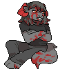
The story continues! We finally get to the club for one thing and Leo continues his meeting with the directors.
BTW can you guess what animal Chops is? People who read the story on DA, don't spoil it!
All fifty first pages plus all the bio pages and some art not seen here is available in printed form from Indyplanet. Only $13.99 http://www.indyplanet.com/index.php?id=1805
<<< PREV | FIRST | NEXT >>>
BTW can you guess what animal Chops is? People who read the story on DA, don't spoil it!
All fifty first pages plus all the bio pages and some art not seen here is available in printed form from Indyplanet. Only $13.99 http://www.indyplanet.com/index.php?id=1805
<<< PREV | FIRST | NEXT >>>
Category All / All
Species Unspecified / Any
Size 800 x 1218px
File Size 579.9 kB
Listed in Folders


http://www.webcomicsnation.com/john.....iac/series.php
Still want to see that glimpse that Libra saw a few pages ago....Moo!
Still want to see that glimpse that Libra saw a few pages ago....Moo!


In spite of the confined spaces and limitations, this page carries quite a lot of weight, and you did a good job making all the elements fit together while keeping things exciting. That and the cliffhanger is a killer! Can someone get that Taz a toothbrush, though?
Panel 1: Leo has gradually changed through the course of the comic, looking more feline and settling into a more reliably drawn style. I like how this panel shows him in a more pragmatic light and gives the reader (and dialogue) a bit more breathing room. Little things like the mug of coffee and the folder help provide a sense of scale and perspective, as well.
Panel 2: Again, pushing Leo to the side a bit and giving the dialogue some room helps with the spacing and 'breathing space'. I like it- in fact, I could learn from that a bit. One tricky thing I noticed with Leo is that his eyes and face seem more youthful, even child-like when he's in profile. From most other angles he's an imposing fellow, but in profile he looks younger. I'm not sure why... perhaps it has to do with his eyes.
Panel 3: Arguably my favorite panel so far, with some good subtle facial work with Leo and good interplay with Morris. It's a simple, but effective panel and I confess it made me crack a smile.
Panel 4: A bit more crowded, dialogue wise, than the other panels but that's not a big problem in my book. Leo seems a bit more laid back than his usual no-nonsense self (though he's still quite serious) and his subtle changes in expression over the panels is great. I'm always an advocate of trying new things, and so far much of the artwork involving Leo on this page brings something fresh to his character.
Panel 5: A decently laid out panel, and I commend you for the illustrations of the characters in the distance- I personally am really bad at drawing miniatures, but you took your knowledge of anatomy and mass and scaled it down pretty nicely here. My only gripe is that this would be a good panel to put a little extra effort in the setting. The club's entryway looks like a back alley! Perhaps a couple columns, an awning, decorative lighting, and carpeting might help. Please, promise me you will try to add a pinch of pizazz to the club's interior!
Panel 6: Those are some bad dudes. No, not badly drawn! This panel serves pretty well to show the new guys' faces in detail before moving on to the action of the next panel, so it sets the stage nicely.
Panel 7: I confess. I peeked ahead. Unfortunately, knowing what happens next kinda defeats the critique I was going to make. While the guys are just goofing around, the faux fight, while held together very well with the characters' facial expressions, might not be violent enough to hit with total 'shock value'. I might be getting a little harsh or unreasonable with that- I don't think I could have done any better with the panel, personally. It's a good panel and is still very effective as a cliffhanger.
I won't say much more except that one thing I miss about DA is the fact that if you wanted to post a comment, you didn't have to stare at an animated GIF advertisement for animal dildos or webcomics with badly drawn pornography. I think I'll learn to live with it, though.


Comments