 FA+
FA+
1217
Views
Views
21
Favorites
Favorites
Category
All / All
Species Unspecified / Any
Size 800 x 1218
File Size 528.1 kB
Report this content
★
More from Eggplantman


Listed in Folders


Off to the club but some snags have come up. Capricorn/Rebecca is too young to go so she'll be heading home with her foster family. Scorpio appears to feel that's unfair.
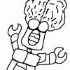
Back at the office, the Zodiac have had their first mission even though it was unplanned to be this early so now Leo has to give his report.
All fifty first pages plus all the bio pages and some art not seen here is available in printed form from Indyplanet. Only $13.99 http://www.indyplanet.com/index.php?id=1805
<<< PREV | FIRST | NEXT >>>
Category All / All
Species Unspecified / Any
Size 800 x 1218px
File Size 528.1 kB
Listed in Folders

Capricorn has a stable family. Which is great and she deserves that much.
Scorpio, I don't know. Intention is honorable, but the way to get there That's the problem. She needs to realize that there are better alternatives.
Leo begins his debrief.
This will be interesting.
Great page.
Scorpio, I don't know. Intention is honorable, but the way to get there That's the problem. She needs to realize that there are better alternatives.
Leo begins his debrief.
This will be interesting.
Great page.


Interesting, it will be enlightening to hear his thoughts on the team. Although I personally would be more worried about his three bosses. One's a show man, another's crackers, and the third could sell a ice machine to Eskimos. I have trouble getting warm fuzzy feelings over those three.


Alright... and now, back to the reviews! Thanks for updating the comic here, dude, I look forward to continuing our 'ol tradition... just in a new place. Let's begin!
Panel 1: Not too much to say about this panel, except that I like the way that Scorpio looks with short hair, and she's got pretty decent fashion sense, too. I was actually kind of surprised by her apparel since I thought she was a bit more of an exhibitionist, but seems to be more mature than you might think after a first impression. It's not a complex panel, but it works and the facial expressions & gesture work nicely.
Panel 2: Very good use of the rear 3/4 view on Cap, again! I kind of wish I had your natural knack not just for anatomy, but anatomy in perspective. Scorpio's reaction is also nicely drawn. I had thought that it would have helped the movement of the eye to put Scorpio on the right and Cap on the left, but when I looked at the way you arranged the dialogue I would say that your positioning was the better choice.
Panel 3: Good use of a wide panel here, but I have one question about the van- do you use reference? I ask because if you don't, it might help to do so even if you're trying to innovate rather than stick to a particular make and model of vehicle. I definitely won't say that I'm an expert at drawing vehicles, but whenever I try to illustrate one I make sure to have some reference handy. It's helpful to have photos or illustrations that show the vehicle from different angles- as with people, the angle can make all the difference! It's mainly a thought, and I like to think that it's a valid one as well because even though backgrounds are typically ignored by readers, cars and vehicles are not- they can become characters in and of themselves, even if they only appear once. Perhaps more importantly, people will forgive you if you incorrectly draw their favorite building but some folks get in such a lather when you mess up their favorite car!
Panel 4: Again, I don't have too much to say about this panel except that I think it's good and economical. You have the characters staged in a fashion that emphasizes their scale and distance from one another and there isn't much wasted space.
Panel 5: Wow, a fifth panel! I have to get used to this since I'll be reviewing full pages... Now contrary to the van on panel 3 the truck makes a great background for Aries here, though his attire sort of reminds me of disco meets cowboy :p I like the subtle little shading marks you made where his shirt is tucked into his pants- believable creases make for believable clothes and it looks like you're starting to move in that direction.
Panel 6: A good, straightforward, and powerful panel. Morris' inclusion in the panel is, at least to me, optional. Part of me argues that you don't need him in it to keep the importance of the scene intact, but part of me also feels that including him gives the reader a sense of scale and makes it clear, at the very least, that he is in the room in case he speaks in a future panel. It's better to show him now than have him mysteriously appear later on and have fans asking 'where did he come from?'.

Comments