 FA+
FA+
216
Views
Views
2
Favorites
Favorites
Category
Artwork (Traditional) / General Furry Art
Species Lion
Size 1250 x 1280
File Size 349.5 kB
Report this content
More from LiimLsan
")


")


Things you would not do at home come naturally on the floor
For dancing... soon becomes romancing...
Even guys with two left feet come out fine if the girl is sweet,
and if by chance their lips should meet while dancing...
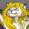
I had a small set of markers nearby and decided to challenge myself a bit. Gentle poses, dynamic faces, limited color.
Marker, 5"x5"
Even guys with two left feet come out fine if the girl is sweet,
and if by chance their lips should meet while dancing...
I had a small set of markers nearby and decided to challenge myself a bit. Gentle poses, dynamic faces, limited color.
Marker, 5"x5"
Category Artwork (Traditional) / General Furry Art
Species Lion
Size 1250 x 1280px
File Size 349.5 kB


Oh, this is cute and lovely at the same time! And it makes me think I should learn something about color theory instead of just drawing pronz all the time XD Seriously, that's a nice effect. As we Austrians say: "G'learnt is 'g'learnt" Interestingly, you will be able to get that saying even without translating it from my dialect.
The only sad thing about this scene is that the guy is apparently about to get hit by that thing that is dropping on his head XD
The only sad thing about this scene is that the guy is apparently about to get hit by that thing that is dropping on his head XD
Best advice I can give?
*Color isn't as important as tone. It should work as a black and white picture.
*Color behaves strangely depending what you mix it with. Mixing white with a color will cool it down and make it opaque, and move it towards blue. Mixing black with a color will dingy it - the color that combines best with black is ultramarine blue, which looks incredibly sad with black. But the farther you get from ultramarine on the color wheel, the color will get worse mixed with black - all the way up to yellow, who is deathly allergic to black.
*To neutralize a color without dulling it, mix it with something opposite on the color wheel.
*Non-digital paint is never really pure, it's always biased towards one color or the other. There are orangish reds and purplish reds, but never a "red" red. There's no such thing. You have to account for this when color mixing, since a greenish yellow and a purplish red will produce a terrible orange, instead of an orangish yellow and red.
Those are the things they do't teach you in school.
Hehe, that's the beveled edge of a spotlight, but it works so well as a falling I-Beam XD
Comments