 FA+
FA+
279
Views
Views
1
Favorites
Favorites
Category
Artwork (Traditional) / Tutorials
Species Cougar / Puma
Size 1280 x 1280
File Size 1.08 MB
Report this content
More from LiimLsan

 part 4")
 part 3")
 Part 1")
")


Continuing the tutorial (I typed 'tuitoruual,' which is probably a word in finnish), this bit's for the jacket, bitches.
VI: You have the understand the reason for the colors when you paint colors. For instance, Denim isn’t a straight blue (Is anything invented in France ever a straight color?). It derives its color from multiple layers. The white fabric underneath, the stained layer of phthalo, then the dye of ultramarine, then the indigo layer on top of that. That’s how they make it in china, multiple layers. As I want this denim to look several years old and well-used, there’s none of those acid wash bullshit effects and all the indigo has been pulverized out by now. That simplifies things! And I’ll want the sky to look more Indigo, so it’ll change. So first, atop the white, I apply a thin wash of a mixture of approx. 70% thin Phthalo Blue, 15% Zinc White, 5% forest green and 10% thin Olive Green. There’ll be a bit of green in there because of sweat stains, so it’ll reflect with a pinch of yellow. Green is a great way to dingy up your blues. Green isn’t actually a color, so it’s a useful optical illusion. (More on this later.) I paint a thin set of that underneath, bearing in mind the relative stress the regions have been subjected to. For instance, the forearm region has rarely been folded or bunched up as the top seems to have, and the amount of material in the pockets and on the front seams prevents them from being easily bunched. Those will have more blue, because they’re less easily wrung.
Here’s also where you start fucking with your subject to increase the composition. I’m picturing the pocket of the Jean lacket as high up, so the arm has to go at this angle, and the hand has to collapse into the pocket at a steep angle to rest. To see this, you need to be very clear as to where the wrist breaks. So I just cut off the cuff of his left arm, to make the angle of the wrist clear; anatomy troubles will be less easily forgiven than fashion insults!
VII: I add some yellow to the layer of cobalt on the steel wall to punch the colors somewhat – and to set it off from the silver-red-denim that’ll be the wolf soon.
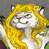
VIII: Again with the reason for color? Animals don’t have a lot of things informing their fur color. Scales can be any color you damn well please, but fur is like human hair. Fur is literally all grown along a spectrum of two sources of melanin – black and white, and yellow and brown. No matter how thin, all animals will have a pinge of both on their bodies. If you want to paint a goth zebra, you delineate the makeup by the natural fur having the peensiest tinge of ochre on the boundary. So this silver wolf will have layers of gold, brown, red, maroon, and ochre under the pelt along the top side, in a few patterns. It helps the fur look natural. I consolidated it into a thin maroon and a thin brown orange on the fur (it’ll change as the light plays off it, and gain in saturation, so the orange is the part being shone on by the fluorescent light).
I add more Phthalo to the mix and put them on the pants, reasoning that the pants are the same age but worn less often and will have richer undercoats. Now that the undercoat’s dry on the jacket, I begin with the more “denim-y” color; a burnish of ultramarine, straight out of the tube (the visible undercoat salves the ugliness that is ‘out of the tube,’ but I don’t recommend it for anything but obviously artificial objects). I apply the yellow-cobalt to the brass buttons to put under the brass. Here you see it half- finished, and the same rule applies – where it’s been wrung the color will be lighter in tone and saturation. The exception is the pockets, which are distressed from the inside, and so have more distress on the undercoat than the top coat. Not that it would really work this way, but it makes visceral sense.
IX: I add judicious neutral black opposite the light sources – a smack bit around the eye, where the fluorescent light doesn’t fall, to consolidate his eyes, and a bluer black on the back of his hand opposite the red cigarette glow. I’ve covered all the denim with Ultramarine, leveling off on the places where it stays darker - the fly, the side, the sewn seams. The seams will need all the saturation as I can spare, I’ll level it off. I paint the zipper with the rigger and a thick impasto of white, ochre, and lemon-yellow. I stain some areas of the pants with it, Edmund Dulac-style.
X: The red on his shirt should look so thick you can’t see the white cotton underfibers. I mix a scarlet with a red and basically just impasto this bitch. Compared to the detail of the denim, this should read as one shaped block of solid color. There’s a bit of watercolor fuckery, but with skill you can suggest folds with small variations of intensity. With no masking fluid, you must be very careful to avoid the area where the bolo tie is to be painted.
VI: You have the understand the reason for the colors when you paint colors. For instance, Denim isn’t a straight blue (Is anything invented in France ever a straight color?). It derives its color from multiple layers. The white fabric underneath, the stained layer of phthalo, then the dye of ultramarine, then the indigo layer on top of that. That’s how they make it in china, multiple layers. As I want this denim to look several years old and well-used, there’s none of those acid wash bullshit effects and all the indigo has been pulverized out by now. That simplifies things! And I’ll want the sky to look more Indigo, so it’ll change. So first, atop the white, I apply a thin wash of a mixture of approx. 70% thin Phthalo Blue, 15% Zinc White, 5% forest green and 10% thin Olive Green. There’ll be a bit of green in there because of sweat stains, so it’ll reflect with a pinch of yellow. Green is a great way to dingy up your blues. Green isn’t actually a color, so it’s a useful optical illusion. (More on this later.) I paint a thin set of that underneath, bearing in mind the relative stress the regions have been subjected to. For instance, the forearm region has rarely been folded or bunched up as the top seems to have, and the amount of material in the pockets and on the front seams prevents them from being easily bunched. Those will have more blue, because they’re less easily wrung.
Here’s also where you start fucking with your subject to increase the composition. I’m picturing the pocket of the Jean lacket as high up, so the arm has to go at this angle, and the hand has to collapse into the pocket at a steep angle to rest. To see this, you need to be very clear as to where the wrist breaks. So I just cut off the cuff of his left arm, to make the angle of the wrist clear; anatomy troubles will be less easily forgiven than fashion insults!
VII: I add some yellow to the layer of cobalt on the steel wall to punch the colors somewhat – and to set it off from the silver-red-denim that’ll be the wolf soon.
VIII: Again with the reason for color? Animals don’t have a lot of things informing their fur color. Scales can be any color you damn well please, but fur is like human hair. Fur is literally all grown along a spectrum of two sources of melanin – black and white, and yellow and brown. No matter how thin, all animals will have a pinge of both on their bodies. If you want to paint a goth zebra, you delineate the makeup by the natural fur having the peensiest tinge of ochre on the boundary. So this silver wolf will have layers of gold, brown, red, maroon, and ochre under the pelt along the top side, in a few patterns. It helps the fur look natural. I consolidated it into a thin maroon and a thin brown orange on the fur (it’ll change as the light plays off it, and gain in saturation, so the orange is the part being shone on by the fluorescent light).
I add more Phthalo to the mix and put them on the pants, reasoning that the pants are the same age but worn less often and will have richer undercoats. Now that the undercoat’s dry on the jacket, I begin with the more “denim-y” color; a burnish of ultramarine, straight out of the tube (the visible undercoat salves the ugliness that is ‘out of the tube,’ but I don’t recommend it for anything but obviously artificial objects). I apply the yellow-cobalt to the brass buttons to put under the brass. Here you see it half- finished, and the same rule applies – where it’s been wrung the color will be lighter in tone and saturation. The exception is the pockets, which are distressed from the inside, and so have more distress on the undercoat than the top coat. Not that it would really work this way, but it makes visceral sense.
IX: I add judicious neutral black opposite the light sources – a smack bit around the eye, where the fluorescent light doesn’t fall, to consolidate his eyes, and a bluer black on the back of his hand opposite the red cigarette glow. I’ve covered all the denim with Ultramarine, leveling off on the places where it stays darker - the fly, the side, the sewn seams. The seams will need all the saturation as I can spare, I’ll level it off. I paint the zipper with the rigger and a thick impasto of white, ochre, and lemon-yellow. I stain some areas of the pants with it, Edmund Dulac-style.
X: The red on his shirt should look so thick you can’t see the white cotton underfibers. I mix a scarlet with a red and basically just impasto this bitch. Compared to the detail of the denim, this should read as one shaped block of solid color. There’s a bit of watercolor fuckery, but with skill you can suggest folds with small variations of intensity. With no masking fluid, you must be very careful to avoid the area where the bolo tie is to be painted.
Category Artwork (Traditional) / Tutorials
Species Cougar / Puma
Size 1280 x 1280px
File Size 1.08 MB
Comments