 FA+
FA+
927
Views
Views
28
Favorites
Favorites
Category
Scraps / General Furry Art
Species Snake / Serpent
Size 1280 x 1034
File Size 175.4 kB
Report this content
★
More from Gruine
")


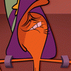
Alrighty you furries, put your critique attitudes into play as I am showing you simple sketches of the next design for my newest made-up pet, Bob! As you can see, with them being listed as 1, 2, and 3, the snakes all have their flaws and things that need to be fixed up. When I usually start designing a character or whatever, I build confidence by drawing it over and over again. So I KNOW that these designs are not the Official design of the future pet for Gruine (which will also be re-design.)
So I need help. I drew these last night while talking to negativetheory on SKYPE :3 Finally, my Skype works X3 But anyways I kept showing Theory the sketches every time I was done with them, and he would comment like, "I like No.2 better... or... do you need the Mohawk?" Well, I explained that the Mohawk is a dedication to the Original Design of Gruine as all of you have known. But... Do I REALLY need to have a Mohawk on this snake? Idk :/ I know I can't draw these perfectly so I wanna hear if you guys want me to keep persisting on the Mohawk, go for another hair design, or have no hair at all. OR should I have something else on his head? :3
YOU FURRIES SHALL JOIN ME ON THIS CONQUEST TO.... um... JUDGE MY DRAWING!!!
Actually, if you want to see a Snake artist, go see tacokurt because... OMG I am in love with his work X3 But anyways, I tried to avoid his style and try using my own. But I feel I need advice. If there's anyway to IMPROVE the design of this character, please COMMENT!!!! If I like what you say and you do leave an impact on me, then I'll thank you in a Vore comic coming soon.
http://www.furaffinity.net/view/9963656/
So be MEAN, be ANGRY, make fun of my SKILLS, throw random PENCILS, laugh at my NOSE, stab me at NIGHT, ask Obama and Mitt Romney to come and join you on an angry rampage against ME, let an angry snake gulp the real ME, just.....
BE CRITICAL!
Cause I want to improve :3 <3
ANY QUESTIONS? PLEASE COMMENT!!!! :3
So I need help. I drew these last night while talking to
 negativetheory on SKYPE :3 Finally, my Skype works X3 But anyways I kept showing Theory the sketches every time I was done with them, and he would comment like, "I like No.2 better... or... do you need the Mohawk?" Well, I explained that the Mohawk is a dedication to the Original Design of Gruine as all of you have known. But... Do I REALLY need to have a Mohawk on this snake? Idk :/ I know I can't draw these perfectly so I wanna hear if you guys want me to keep persisting on the Mohawk, go for another hair design, or have no hair at all. OR should I have something else on his head? :3
YOU FURRIES SHALL JOIN ME ON THIS CONQUEST TO.... um... JUDGE MY DRAWING!!!
Actually, if you want to see a Snake artist, go see
 tacokurt because... OMG I am in love with his work X3 But anyways, I tried to avoid his style and try using my own. But I feel I need advice. If there's anyway to IMPROVE the design of this character, please COMMENT!!!! If I like what you say and you do leave an impact on me, then I'll thank you in a Vore comic coming soon.
 http://www.furaffinity.net/view/9963656/
So be MEAN, be ANGRY, make fun of my SKILLS, throw random PENCILS, laugh at my NOSE, stab me at NIGHT, ask Obama and Mitt Romney to come and join you on an angry rampage against ME, let an angry snake gulp the real ME, just.....
BE CRITICAL!
Cause I want to improve :3 <3
ANY QUESTIONS? PLEASE COMMENT!!!! :3
Category Scraps / General Furry Art
Species Snake / Serpent
Size 1280 x 1034px
File Size 175.4 kB


I don't see anything wrong with keeping the mohawk. Yes, snakes don't have hair, much less mohawks, but then again that makes your snake rather unique, because it does! I don't feel that it hurts the character in any way. And in terms of mohawks I rather like the 2nd picture best. The way the mohawk seems to flow straight back and merge into the snake's body for some reason reminds me of a cobra's hood. It's more like just an extension of the snake itself, rather than a brush of hair on their head.
As for the snakes I like the 3rd best, but probably only because of his sinister look. He looks so sly and devious, and that feels much more snake-like to me. Also I rather enjoy the toony style of them. Their faces look much more bold and brunt than might be typical for a snake, but like the mohawk I think it makes them unique and appealing. They feel like they have more personality.
Anyway, those are just my thoughts. I like them! I look forward to the comic!

HEY! Thanks for the shout out, and you're doing great so far, the faces are expressive and fun, keep it up and practice doofy expressions where you learn to stretch the faces out in silly but expressive ways :3 I've not hit that target yet but I'm working on it, just have fun first and foremost :3

So... looking at all three of the versions, and assuming that we are here to decide on which features look best, here are my thoughts on them:
1. Honestly, this one would have to be my least favorite out of the three listed. Since this is going to be a predatory character, I think it just seems a little bit too cartoony and "silly" looking for such a role. The way the mohawk ends makes it look a little bit odd in the grand scheme of things, as does the snake's snout. The bottom portion should stick with being the typical flatness, while the wrinkles on the top play to the cartoony appearance (although I'm unsure if that's just because of his expression?), along with the eyes being closer together.
2. I actually like this design quite a bit more than the first one. The mohawk in this one looks far better in my opinion, as does the overall facial structure of the snake. The slight elevation on the nose bridge, as well as the more natural bottom jaw, makes the design all the more appealing. The eye set is also a lot better, but my preferences still sway towards the one stated below.
3. This one pretty much as a similar amount of appealing nature than #2. The front tip of the mohawk looks better to me than the front portion of #2's does, and the eye set really does seem to suit the character design a little bit more. The sectioning of the lower jaw, as well as the slight "fattiness" to the throat area beneath it, look really nice on the character.
To be perfectly honest. I think you would benefit from making a character that incorporated both features from #2 and #3. Specifically, using #2 as a base, keep the general mohawk style, the elevation of the nose bridge, and the jaw style, but incorporate the front portion of #3's mohawk, the section lines on the jaw, the slightly fatty throat area, and the eye set in #3. Just my opinion, though.


Number one has a bit too wide top part of the mouth, and face is a bit too round for that style, and just doesn't fit with the mohawk. As O just stated the snout just doesn't work with the rest of the face, and looks just a bit too cute and un-predatory.
Number two's mohawk is a bit weird, but could easily be changed slightly to fit the face. The lower jaw suits this character much better then #1. Then elongation of the snout really helps, and makes the face structure more firm. This one is an improvement.
Number Three is the best of all. Here you have a great facial structure, and lovely jaw, and the fat in the neck area really helps to solidify him. Love the eyes on this version, as they really seem to suit this character, and help to personalize him. The mohakw connects to the head and seems to really fit him. Of all the three, I believe this is the winner.
But don't decide on a final design just yet, as there can always be room for improvement, and always other views, options, opinions, etc... Just make sure that in the end, you decide what you like best, and go with it. <3 <3 <3 <3


Comments