 FA+
FA+
2371
Views
Views
121
Favorites
Favorites
Category
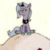
All / Bondage
Species Unspecified / Any
Size 600 x 643
File Size 237.2 kB
Report this content
★
More from grrrwolf
")


Dancing to darkwave with bass that you can feel in your groin, the music that feeds, gorging on the sound that beat beat beats.
Dancing with the one who taught me to flow, to move, to free myself.
Free on a leash, being pulled and let go, being made to heel, to obey, to writhe and flaunt.
Thumping, grinding rhythm, my body blazing like a torch.
Straps, chains, links, studs all adorn, twinkle, and fasten me tight in their manufactured glory.
Leather tightening, caressing, squeezing my legs.
Mesh feeling like a breeze prickling along my body, its thread scissoring across my nipples.
Tarted up in lipstick, nails polished, eyes lined, wearing a thong that made my sex perspire.
We looked good, we danced good, we made them stare, we made them want to be us.
I loved it and I'll never forget it.
Thank you, Equis, my friend..., my friend...
_________________________________
Happy New Year, everyone. I'm so glad to get 2007 behind me.
Category All / Bondage
Species Unspecified / Any
Size 600 x 643px
File Size 237.2 kB


*giggles* Now I have questions to what are your questions! You made me curious, and laugh, and feel flattered. Thank you so much for your complements. I want to post more, I just have a lot of commissions I'm working on all at the same time, and hopefully they'll be finished soon so I can flood the boards with them! Anywho, hope you're doing well, and again, thank you. ^_^
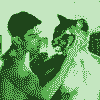

Lovely and wonderfully expressive (with the overlay bordering on being chaotic, but I guess that was the nature of that experience ^^)
Sometimes I wonder where you take the stamina from to work on a picture on and off through 4 years...
PS: I hope you've received my little excuse for a christmas mail? :)
Sometimes I wonder where you take the stamina from to work on a picture on and off through 4 years...
PS: I hope you've received my little excuse for a christmas mail? :)
^__^ Oh thank you, Bunnyboi! *nods* Indeed it was!
Well, I revisited this one, is more like it. I was working on it a bit in 2007 but I couldn't get it to work how I wanted, but seeing all the 2008 submissions with New Years themes it made me think and want to create again. It had been a long time since I have been able to just work in Photoshop and things worked out wonderfully. Often enough I have the inspiration but not the opportunity to create at the same time, or when I know I should be working on art/commission I feel like oatmeal. Bleargh. It's a curse.
P.S. I did! Thank you! Gah, I feel so horrid that I didn't answer back. I'm a horrible juggler! Bad puppy, bad bad puppeh.


ya know......I like a pic that has more of a purpose to it than to be pawwing fodder. I knew I watched your art for a reason, and I am NOT disappointed. T
his work is truely moving, in more ways than just looking like it should start moving on its own, its moving forwards, moving then, moving now, moving into the future, and moving on. Its pumping, pulsing emotion, memories that thump the earth when recalled, an absolute MASTERPIECE of song and art. but most of all, its something you'll always have in your heart.
I understand and fully respect the emotion that went into this.
Its a very deeply moving image and the addition of the description makes it as special as that night.

*^__^* D'awwwww, thank you Pandaboi, I really do appreciate it. I've been trying for a long time to get this one to work, and when it was finally doing so I got all happyexcitedyea! I wanted it too feel like lights were out of control, the movement was in time with the chaotic beat, all that good strutty, dancy stuff. I love that BOOM-TCHH beat, those exquisite haunting melodies, that new wave everyday-is-halloween thematic declaration. *happy sigh*


Thank you. And sure....basically I do a completed sketch, and in this case I brought it into Photoshop CS2 (I normally use 5 because it's less taxing on my computer and I just like the interface a lot more) and used "Aged Photo" in Actions because it just helps fill in all the tiny gaps and makes the scan very bold and darker. I'll bring it back in Photoshop 5 and I try dragging and dropping different images of textures that I have in my reference archive. I had been trying for almost a year to try different lighting effects, backgrounds and such to get it to work because I wanted to keep the effect of a club environment. (The event/memory actually happened at Further Confusion one year I believe.)
Anyways, I had found a black and white photo taken of a christmas ornament with some tinsel. I put that on top and in the Layers window I kept trying different interactions in the pull down menu and I think it was either "Overlay" or "Soft Light" that got a wonderful interaction with the sketch. I also put some fractal art on a separate layer and adjusted that as well. (to find where to make adjustments, it's in the pull down menu on the Layers tab next to "Opacity" that should start out at the "Normal" setting. Messing around with the different adjustments, and Opacity together makes for some very interesting effects and imagery. Also, if that layer isn't working but it has that undefinable quality you're looking for, try going into Image > Adjust > Invert to see if maybe that works better.)
You usually have to do some erasing here and there because even though the texture layer as a whole might have what you're looking for there are still some aspects that distract or cover up, so erase where necessary so your sketch can show through. I also went back with the airbrush set to "Darken", "Lighten", "Color Dodge", "Color Burn", and "Multiply" to make other things stand out, subdued, shine, reflect, etc., especially in the case of my eyes, the spikes and studs, the leash/chain, and other gear. Also making adjustments in Image > Adjust > Variations, and/or Hue/Saturation, and/or Brightness/Contrast really helps bring more realism to the image. Adjusting the hue and making shadows darker all helps. Setting the brush to "Overlay" or "Screen" can really help add atmosphere and light reflection in different areas.
I also used the Lasso and outlined the upper bodies and faces and then used Contrast to really help them stick out of such a busy background and foreground. I try to look at areas in terms of light and shadow, and dark shadows really help bring a lot of realism, I can't say that enough. But also getting highlights on certain areas really helps to get them noticed.
There's a lot of little things to tweak here and there, but another thing that I normally do with any pic is that once it's all finished I save the photoshop file and then save it again as a variant. That way I can preserve all the different layers in the original file and go onto finishing up the image in the variant photoshop file. In the secondary/variant file, the one that's flattened, I duplicate that layer and then I will use "Sharpen" on the bottom layer. Then I'll go to the top layer use a large sized eraser on areas that I want to bring more attention to. I'm basically erasing holes in the top layer to show the sharpened layer underneath. Doing that on areas like the eyes, lips, clawtips, shoulders, just parts that you want to appear more in focus and that way the rest of the image doesn't get that grainy look that can sometimes happen, and you get a more photo-realistic feeling. I'll do that for fur and hair, too.
I like to play with blurring the edges, areas towards the bottom of the picture to help focus on what's going on. An artist that does this well and makes for a good example would be Zen in how he uses a lot of forced perspective and blurry foreground elements like blades of grass or feet. I like to have a themed reference folder for the image I'm working on, too. I'll put reference pix, music, images to help me focus and create the ambiance I'm working for. In this case I had personal memories, but I also was reminded heavily of the scene from Labyrinth with the masked ball, as well as the glittery look from the movie Party Monster in many of the rave scenes and from the costumes. That and I was listening to darkwave music as well as Nine Inch Nails.
Anyways, I sort of detracted from this picture specificall but almost each picture I do is done in a different way or sequence because what works for one might not for the other. I try to not let myself become an art dispenser that way, or just make cookie-cutter art. It doesn't help that I'm agonizingly slow and too meticulous and picky, but the artists I admire most were the Renaissance painters, and to me Norman Rockwell was a moder day Renaissance painter, and to an extent so is Alex Ross. There are other artists here that just blow my mind and I just am in awe of what they do and how they do it. On the other side of the coin I wish I could just do line art, do simple art, and maybe flat tones or cartoony. I donno, but I just have a hard time keeping it simple. I don't even use normal art supplies, just a bic disposable pencil with sketching.
At any rate I'm getting a monitor headache, but I hope that helps. ^_^
Holy Christ!!!
How did I NOT know this was here for SO long?!!
I owe you a hundred thanks! I can't wait to try these effects!!
I'm also big on 18th and 19th century Dutch and French realist painters. I have a pool of heroes I totally admire, like Ilya Repin, Sargent, and this Antonio Guy that just had a show in Philladelphia.
Hey, I sketch with just a simple ballpoint pen too, sometimes the best tools are the most simple ones.
*lol!* Oh no worries, glad I can help. =)
Your work is amazing, btw. I could have sworn I was watching you because I love Love LOVE your Meisha picture especially. *thumpy heartbeats* *rewatches*
Vermeer is amazing, soulbrotha.
And indeed, simple is good. Love all the different textures you use, though!
Your work is amazing, btw. I could have sworn I was watching you because I love Love LOVE your Meisha picture especially. *thumpy heartbeats* *rewatches*
Vermeer is amazing, soulbrotha.
And indeed, simple is good. Love all the different textures you use, though!


This is wild, exotic and thunderous
Like when your eyes suddenly stop seeing for a second
And that bright light rattles you
Not enough blood in your brain
As you stumble and listen to the whine
and enjoy the silence for a moment
The inability to see
And exodus
As your body returns to its natural state.
I wish I had done this.
Like when your eyes suddenly stop seeing for a second
And that bright light rattles you
Not enough blood in your brain
As you stumble and listen to the whine
and enjoy the silence for a moment
The inability to see
And exodus
As your body returns to its natural state.
I wish I had done this.

ok, i just cant get over this pic...the mood is perfect and their poses and expressions just fit the scene. the mist and shine make the picture look like its going to come to life, and the commentary helps u imagine it so clearly. very beautiful
plus: who doesnt like collars and leather :P
plus: who doesnt like collars and leather :P


*giggles* Thanks Krahnos! *hugs* Gah, I have such a hard time drawing equines, tho, but I'm really happy you like it. It's especially nice that you're all wondering and curious looking at the picture...I never really thought of it as a mysterious piece, which makes this a bonus for me. ^_^
Oh you, you flattering wolf, you! *blush* Thank you, Wirewolf, for sharing your reactions. *^_^* It was done pretty much to get me back into shape, so to speak, after being away from photoshop and drawing for so long since I got a mountain of commissions to get back to. Argh.


*giggles* I just wanted to tease you. ^_^
Anyways, here goes....*takes a DEEP breath*
Basically I do a completed sketch, and in this case I brought it into Photoshop CS2 (I normally use 5 because it's less taxing on my computer and I just like the interface a lot more) and used "Aged Photo" in Actions because it just helps fill in all the tiny gaps and makes the scan very bold and darker. I'll bring it back in Photoshop 5 and I try dragging and dropping different images of textures that I have in my reference archive. I had been trying for almost a year to try different lighting effects, backgrounds and such to get it to work because I wanted to keep the effect of a club environment. (The event/memory actually happened at Further Confusion one year I believe.)
Anyways, I had found a black and white photo taken of a christmas ornament with some tinsel. I put that on top and in the Layers window I kept trying different interactions in the pull down menu and I think it was either "Overlay" or "Soft Light" that got a wonderful interaction with the sketch. I also put some fractal art on a separate layer and adjusted that as well. (to find where to make adjustments, it's in the pull down menu on the Layers tab next to "Opacity" that should start out at the "Normal" setting. Messing around with the different adjustments, and Opacity together makes for some very interesting effects and imagery. Also, if that layer isn't working but it has that undefinable quality you're looking for, try going into Image > Adjust > Invert to see if maybe that works better.)
You usually have to do some erasing here and there because even though the texture layer as a whole might have what you're looking for there are still some aspects that distract or cover up, so erase where necessary so your sketch can show through. I also went back with the airbrush set to "Darken", "Lighten", "Color Dodge", "Color Burn", and "Multiply" to make other things stand out, subdued, shine, reflect, etc., especially in the case of my eyes, the spikes and studs, the leash/chain, and other gear. Also making adjustments in Image > Adjust > Variations, and/or Hue/Saturation, and/or Brightness/Contrast really helps bring more realism to the image. Adjusting the hue and making shadows darker all helps. Setting the brush to "Overlay" or "Screen" can really help add atmosphere and light reflection in different areas.
I also used the Lasso and outlined the upper bodies and faces and then used Contrast to really help them stick out of such a busy background and foreground. I try to look at areas in terms of light and shadow, and dark shadows really help bring a lot of realism, I can't say that enough. But also getting highlights on certain areas really helps to get them noticed.
There's a lot of little things to tweak here and there, but another thing that I normally do with any pic is that once it's all finished I save the photoshop file and then save it again as a variant. That way I can preserve all the different layers in the original file and go onto finishing up the image in the variant photoshop file. In the secondary/variant file, the one that's flattened, I duplicate that layer and then I will use "Sharpen" on the bottom layer. Then I'll go to the top layer use a large sized eraser on areas that I want to bring more attention to. I'm basically erasing holes in the top layer to show the sharpened layer underneath. Doing that on areas like the eyes, lips, clawtips, shoulders, just parts that you want to appear more in focus and that way the rest of the image doesn't get that grainy look that can sometimes happen, and you get a more photo-realistic feeling. I'll do that for fur and hair, too.
I like to play with blurring the edges, areas towards the bottom of the picture to help focus on what's going on. An artist that does this well and makes for a good example would be Zen in how he uses a lot of forced perspective and blurry foreground elements like blades of grass or feet. I like to have a themed reference folder for the image I'm working on, too. I'll put reference pix, music, images to help me focus and create the ambiance I'm working for. In this case I had personal memories, but I also was reminded heavily of the scene from Labyrinth with the masked ball, as well as the glittery look from the movie Party Monster in many of the rave scenes and from the costumes. That and I was listening to darkwave music as well as Nine Inch Nails.
Anyways, I sort of detracted from this picture specifically but almost each picture I do is done in a different way or sequence because what works for one might not for the other. I try to not let myself become an art dispenser that way, or just make cookie-cutter art. It doesn't help that I'm agonizingly slow and too meticulous and picky, but the artists I admire most were the Renaissance painters, and to me Norman Rockwell was a moder day Renaissance painter, and to an extent so is Alex Ross. There are other artists here that just blow my mind and I just am in awe of what they do and how they do it. On the other side of the coin I wish I could just do line art, do simple art, and maybe flat tones or cartoony. I donno, but I just have a hard time keeping it simple. I don't even use normal art supplies, just a bic disposable pencil with sketching.
Well, that's how I did this one, specifically. Not every picture is done the same way and sometimes I just look for different ways to do something.

Wooooooow, thank you for the nice art tip, I am surprised to understand everything though I rarely use Photoshop for colours, and never at this complexity rate !! There are some very wise actions I might reuse myself in a more or less near future, thank you again for taking so much time to explain ^^


Oh god this is so sexy! <3
I love the intro in the 'artist's comments box'
I love love love the bondage in this! I am loving the colors and the shading as well. Those outfits are niiiice =3 *giggles*
Just curious, how long did this take you and how much would you charge for a pic like this?
<3333
You did a fantastic job! <3 So yummy delicious =3
Thank you!!!
Thank you so much for all the wonderful complements. You're so nice, and flattering!
As far as how long it took...gah, I donno, because I started it in 2004 but I didn't finish it until 2008, but it's not like I was working on it every day either. I just get stuck and don't know where to go, so I wait patiently and come back later on.
But since this isn't really color work and I was able to be free and creative, probably $100. (my color work like this http://www.furaffinity.net/view/1114204 & http://www.furaffinity.net/view/221346 & http://www.furaffinity.net/view/204400 costs $300 because it's so meticulous)
Thank you for your candy-coated compliments, I'm on a sugar high! ^_^

Comments