 FA+
FA+
282
Views
Views
1
Favorites
Favorites
Category
All / Baby fur
Species Turtle / Tortoise
Size 1033 x 1280
File Size 133.1 kB
Report this content
More from Lig


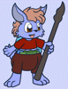
Well here's yet another babyfur your rarely see. A Turtle. I had fun drawing him. And I've giving him a lil piece of futureistic tech. The band on his left arm is actually mini computer. The colored section is a holo emitter. He's pretty much a nerd and watches Ninja Turtles constantly. Bet you can guess which one he likes. LOL.
Category All / Baby fur
Species Turtle / Tortoise
Size 1033 x 1280px
File Size 133.1 kB

Disregarding the fact that it's wearing a diaper:
- It's center of gravity is way off. It looks like it's going to topple over sideways.
- It's thighs are way too thin compared the it's calves. It looks mutated and deformed.
- The background lacks any depth whatsoever. I could swear you've used a photoshop stamp brush. It sucks for real paintng, you know.
- It doesn't actually look like it's standing up. The feet are too leant back for it to be right.
- The sun is too low in the sky for it to look like midday. In fact, the sun shouldn't be visible at all.
- The water looks opaque. It needs movement. Reflection. Transparency, something.
Thanks for the Artistic Critique . I know I need work on my backgrounds and feet. And yeah now that you mention it his center of grav does look off. He was a quick draw an quick color. I'll try to do better next time but if I may offer you a tad of advice. When giving some artistic Critique it is also helpful to point out what came out right. Otherwise you may come off sounding biased or rude. And also it's a good idea to know the person who's art your critiquing. Critique from a stranger more often comes off as an insult at first. Which frankly is how I first felt about this but your Critique does have a point and merit.
I'm just being honest. If I knew half the people I was critiquing I would soften the blow too much in order to spare their feelings. But unfortunately, that's not my goal. My goal is to be brutally honest about people's work, in order to make them better artists.
It's hard to point out what went "right" with the picture due to the content. You need to have some kind of composition in order for a piece to be aesthetically pleasing. There is literally nothing to look at in this picture beyond the character, and he's just standing there.
If I were to suggest an alternate composition, I'd draw more attention to the wrist computer he has. It has a holo projector? He likes watching TMNT? Why not draw him watching TMNT on the projector? You don't even have to draw all of him. Just the top half will do.
Looking through your work, it seems as though you draw the picture as to have the diaper as the focus (in this one, it's directly in the center. Shouldn't it be his eyes, as it's a picture of him, not his underwear?). May I suggest that you avoid this, and keep in mind that subtlety makes the difference between a good picture and a bad picture. Take the thing out of the limelight and a whole avenue of better compositions will arise. Trust me. It's hurting your pictures' quality.
Why draw things with diapers at all? It gets incredibly monotonous, and the character designs are just "[anthropomorphic animal] with diaper." so this might be the perfect opportunity to perfect your character design skills. Remember too that if you put one human article of clothing on an anthropomorph, they will look naked if you don't add the rest.
Ah well I can see your logic. But t he reason he's in diapers is cuz he's supposed to be a babyfurr and that's usually the standard article of clothing worn. I would have added a shirt but that would have obscured a few features such as his shell. And also I hadn't thought about his diaper bing the center of the pic. If you put the face in the center that cuts off stuff. And well Yes there could be more to the pic then just him but for one I didn't know what else to add and the background I sorta just threw in there because I wasn't very sure what to do for a background. And as for not focusing more on the mini computer well and having him watching TMNT is cuz I hadn't thought about it until I was posting this. And as long as we're being honest I have looked at your art. I do like some of it but you have room for improvement as well. Then again that could simply by my bias towards a different art theme and style talking. Hence why I didn't comment on any of your stuff. I do appreciate the critique though. However I do wish it wasn't the first comment on this pic seeing as this long discussion in it might scare some off from commenting.
I invite you to critique some of my work. If my work needs improving, then by all means feel free to tell me where I went wrong. Don't be shy. Try to avoid my earlier work - it's pointless critiquing that, as it's months old.
I'm sure people won't mind my comments. I mean, it's just critique. It's productive and good for the artist.
I'm sure people won't mind my comments. I mean, it's just critique. It's productive and good for the artist.
Comments