 FA+
FA+
280
Views
Views
15
Favorites
Favorites
Category
Artwork (Traditional) / Fantasy
Species Unspecified / Any
Size 1158 x 872
File Size 1.18 MB
Report this content
More from glowsheep


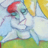
Piece one in my 15 part concentration series for school.
This is going to be a loooooong school year.
This is going to be a loooooong school year.
Category Artwork (Traditional) / Fantasy
Species Unspecified / Any
Size 1158 x 872px
File Size 1.18 MB
Actually, I only used a little bit of watercolor, but only because I forgot to bring my inks to school and I did some of the under painting with crappy Prang watercolors from school. XD
Most of the color on this is india ink, but I also used heavy body acrylic paint and colored pencil too.
Most of the color on this is india ink, but I also used heavy body acrylic paint and colored pencil too.

Mixed mediums which turn greatly. Special cookie for you.
Maybe the first roof and the character should be as finished as the cat in the air fan? I mean... To have the same lines, not to be vanished in the background.
Just a little critic, but that's so incredible, so moody. That makes me dream... +Fav!
Maybe the first roof and the character should be as finished as the cat in the air fan? I mean... To have the same lines, not to be vanished in the background.
Just a little critic, but that's so incredible, so moody. That makes me dream... +Fav!
I really struggeld with deciding how much pen-inking I wanted to do, since I really didn't want anything to look "outliney", and I really wanted to have a really unified, free-flowing picture... I think for the next one I'm not going to use the fountain pen as much and maybe even try watering down the ink just a little. But... I totally failed miserably on the cat, that is drawn out WAAAY too much, when it's supposed to be nice and subtle like the girl, and I'm kind of lost on what to do so that it looks like a cat, but isn't "stealing the show" from the rest of the picture like it is now. I've since tweaked it a little bit, but the cat is still poking out too much. I've re-painted over him like, three times already.
Mostly the "inconsistencies" are because I'm pretty loose with how I do things and I treat my pictures more like designs than illustrations if that makes sense. XD I treat the picture like a layout of colors and shapes, then flesh out subject matter around the design according to what fits the larger "feel" so nothing is ever the color it "is" and big ink marks only go where I feel there aren't enough big ink marks and splotches of electric lime green sneak into shadows where the unlikely shade of electric lime green just belongs, gosh darn it! XD I'm hoping over time I'll learn how to really be effective at it. @_@ I hate how everything I do looks unfinished when I'm going for "loose."
Mostly the "inconsistencies" are because I'm pretty loose with how I do things and I treat my pictures more like designs than illustrations if that makes sense. XD I treat the picture like a layout of colors and shapes, then flesh out subject matter around the design according to what fits the larger "feel" so nothing is ever the color it "is" and big ink marks only go where I feel there aren't enough big ink marks and splotches of electric lime green sneak into shadows where the unlikely shade of electric lime green just belongs, gosh darn it! XD I'm hoping over time I'll learn how to really be effective at it. @_@ I hate how everything I do looks unfinished when I'm going for "loose."
Comments