 FA+
FA+
382
Views
Views
5
Favorites
Favorites
Category
Artwork (Digital) / Fanart
Species Unspecified / Any
Size 400 x 200
File Size 3.3 kB
Report this content
★
More from Synchra

")
")


Listed in Folders


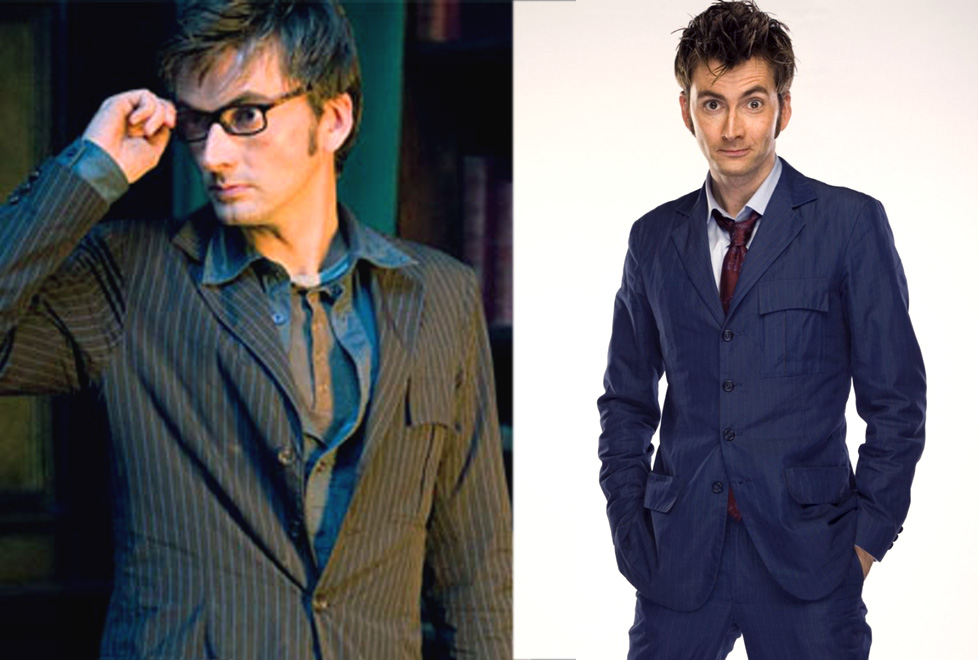
This is from March but honestly it's just LINES.
ABSTRACT TENTH DOCTOR SUITS.
I didn't even bother to sign it because.. lines! I made this more to make the point that Ten's suits are not just brown with white or black pinstripes or blue with.. nothing. They're quite unique awesome colors! (Although i understand simplifying the blue. Those red stripes are hard to see for some reason.)
I use these to color pick off of when I do fanart. XD
Category Artwork (Digital) / Fanart
Species Unspecified / Any
Size 400 x 200px
File Size 3.3 kB


The red lines are hard to see because of that thing called color theory.
As I understand it, it's mostly the saturation in use and the weight of Blue vs Red. Because in the case of this example they are fairly close to one another, only different in base color they get hard to focus on.
Recently I have been giving my characters far less saturated colors even though they still look the intended color still, it's just less... The term would be unnatural. One of the artist's I watch on youtube put out a nice thing on color theory that talked about how too many primary colors in majority look right away impossible if it's a "natural" scene.
This one specifically http://www.youtube.com/watch?v=IuxzqXCXX_k
That video actually really helped me to pull back saturation. :)
As cool as that is.. I did go to art school so I do indeed know what color theory is! (I had a whole class on it! lol) Anyway, the colors more true to how they are on screen so I wouldn't be "fixing" them. They're actually a red that was hit with blue dye to make it more "brown" to be the reverse of the other suit but they came out as that weird saturation that tricks your eye from far away.
http://3.bp.blogspot.com/-z74TyrSBi.....1600/suit8.jpg
http://4.bp.blogspot.com/_TcWHiqyb4.....dw406_0059.jpg
Those stripes are hard to see! I actually made them a slightly more visible than they are (part of it is that they're so thin!)
http://3.bp.blogspot.com/-z74TyrSBi.....1600/suit8.jpg
http://4.bp.blogspot.com/_TcWHiqyb4.....dw406_0059.jpg
Those stripes are hard to see! I actually made them a slightly more visible than they are (part of it is that they're so thin!)
Haha yeah. XD Since I am such a dork I read extensively on how the suits were made here: http://tennantsuit.blogspot.com/ Lol this guy talked to the costume designer a ton.
Comments