 FA+
FA+
909
Views
Views
70
Favorites
Favorites
Category
Artwork (Traditional) / General Furry Art
Species Bat
Size 1065 x 1280
File Size 178.4 kB
Report this content
★
More from ReDaDillio


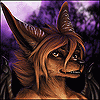
Vida The Spotted-Fruit Bat
The Short
Well, here she is, the newly redesigned Vida to reflect the cute/goth/punk. I wound up changing the character quite a bit.
Added Bonus: SHE’S FINALLY COLORED! =D
I'm also trying out a brand of character sheets. Three images; 3/4 body, a bust, and full body back; arranged in whichever composition (depending on the character and mood). Another of my ideas I've let lie for toooooo long XP.
She’ll be popping up in another image her soon (or whenever I can get to it ^^;; ).
Hope y'all like
(Critiques welcome; especially on spelling XP)
The Long
The hairdo was completely redone. I was inspired by a coworker who had some of the traits I wished to apply to Vida. The effect of the bangs covering one of the eyes is a sign that she chooses to hides a bit of herself away. The green is a nod to my favorite Legionnaire, Violet, who had the same type of "dye-job" after the Emerald Eye Saga, which also explains her smaller frame and violet color theme.
Her previous design had several ear piercings, but no other ones on her body. Taking it a little further (which sounds odd I know; I'm not really into piercings), I added two more on her left eyebrow and lower lip/upper chin area while also removing the two upper ear piercings (figured they'd weigh her ears down a bit).
Reminding myself that I'm a cartoonist at heart, I chose to scale down the detail of her wings to a fin-like shape. Much like in earlier designs, the wings would expand and contract depending on Vida's mood and expression, however not as exaggeratingly due to their scale.
Her patterns were scaled down a bit and were altered to be more speratic.
I scratched the idea of long pants as they would hide too much of her patterns below her knee. Instead, I opted for a short skirt with helps emphasis her "cute factor." On top of that, I opened the top of her shirt to bare more shoulder and show a little weakness.
Speaking of clothes, I figured during her redesign that Vida is a brand-girl (loyal/obsessive over clothes made by one company; another element I borrowed from a coworker) so I made up a mock brand company StrawBerri and added a mock logo to the bottom of her skirt. The "Vampires Suck" T-shirt would also fall under that brand.
Background
Aside from the nod to a comic book super-teen, there was an older character idea that carried over to Vida. A few years back I had this idea of revamping classic monsters into college students. And one of the character ideas that sprang from that was a vampiress Southern girl. Yaknow, the farmer's daughter type. I'm not too sure where the idea came from, but I loved the idea. While figuring a design, I thought freckles would be an interesting element to add over her pale vampire skin.
I never followed through with the idea, nor did I design this Southern Vampiress, but it seems the freckled bat-like element found its way to Vida when I first designed her.
Well…that’s all I can think of right now. XD
/endnovel XP
Category Artwork (Traditional) / General Furry Art
Species Bat
Size 1065 x 1280px
File Size 178.4 kB


Funny that you mentioned, b/c I did consider doing that to pull the focus into the central image.
I opted to keep the side images the same so people can sample the colors (say, for the face) a little easier.
But still, I do agree with your suggestion. I may use that element in future versions of these character studies.
I opted to keep the side images the same so people can sample the colors (say, for the face) a little easier.
But still, I do agree with your suggestion. I may use that element in future versions of these character studies.


Comments