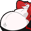
One of my awesome shark week freebie pieces by  Took a while to ink and color cause it was so complex, but I'm happy with how it turned out fior sure ^^
http://www.furaffinity.net/view/8612708/
This is one of my entries for 'Shark Week.' Last Shark week, fatalglory128 fatalglory128 made a list of sketches he wanted, one being Iron Gut stuck at a restaurant table (with tons of plates) with a double-sized belly bursting out of his clothes. I liked that idea so much, I wanted to draw that, but I needed to wait until the next Shark Week, obviously.
Here, I took this angle to emphasize the belly and its belt destruction. (sewergator sewergator's pictures helped me with the rippage, while Matthew Smith's sample of <i class="bbcode bbcode_i">Close En-COW-ters!</i> were an influence in the belt destruction.) However, I am going to need to draw another picture of a different angle for different emphases.
To be honest, I fear that my sketch is too messy and ambiguous for him to work. After all, I am the only one who worked on my sketches so far, so I am the only one who needed to know what each element means. I hope that working on this sketch is not too difficult.
(For clarififcation, the big rectangle on the top of the picture is his belt-buckle, while the thin rectangle in the middle of the picture is the little metal part of the belt buckle where you put the belt notch/hole. The bits on the right side of the picture near the belt are actually pieces of the belt breaking off. The darkness bellow the booth seat is actually a big hole so that animals with big tails can sit comfortably.
[=====]
 Took a while to ink and color cause it was so complex, but I'm happy with how it turned out fior sure ^^
http://www.furaffinity.net/view/8612708/
This is one of my entries for 'Shark Week.' Last Shark week, fatalglory128 fatalglory128 made a list of sketches he wanted, one being Iron Gut stuck at a restaurant table (with tons of plates) with a double-sized belly bursting out of his clothes. I liked that idea so much, I wanted to draw that, but I needed to wait until the next Shark Week, obviously.
Here, I took this angle to emphasize the belly and its belt destruction. (sewergator sewergator's pictures helped me with the rippage, while Matthew Smith's sample of <i class="bbcode bbcode_i">Close En-COW-ters!</i> were an influence in the belt destruction.) However, I am going to need to draw another picture of a different angle for different emphases.
To be honest, I fear that my sketch is too messy and ambiguous for him to work. After all, I am the only one who worked on my sketches so far, so I am the only one who needed to know what each element means. I hope that working on this sketch is not too difficult.
(For clarififcation, the big rectangle on the top of the picture is his belt-buckle, while the thin rectangle in the middle of the picture is the little metal part of the belt buckle where you put the belt notch/hole. The bits on the right side of the picture near the belt are actually pieces of the belt breaking off. The darkness bellow the booth seat is actually a big hole so that animals with big tails can sit comfortably.
[=====]
Category Artwork (Digital) / Fat Furs
Species Shark
Size 1280 x 797px
File Size 131.2 kB
I feel... kinda bittersweet. I mean, a lot of the stuff that you colored in does not match what I had in mind:
# The blue rectangle under the yellow belt buckle is supposed to be yellow, since that is actually part of the metal part of the belt. (You know about that little metal part from the belt buckle that goes into the belt notches. The blue rectangle is supposed to be that part.
# The blue straps surrounding him were supposed to be his belt.
# On his left side there are two blue straps that are supposed to be the belt. The bottom strap is not supposed to exist.
# There was supposed to be only one line above him, that is, the one separating the wall
# The window was meant to be the cushiony back part of the booth seat.
# The green part of the seat is actually meant to be a hole for his tail to fit.
# The plates were supposed to be round. (I have a very bad sketchy style.)
# The navel was not meant to have a curvy line on top. (...same.)
# There was supposed to be leftover food crud on them.
I clarified some of these points in the description, plus the other picture, which was the same scene in a different angle, clearly shows the back cushion, the back, and the hole for the tail. I was hoping that you would clear up on any doubts and consult me, since I have a messy sketching style which I mentioned in the original comments. I'm offended.
...that was the bitter part. The sweet part was the work you did on this. I mean, the line art is simplified, yet the colouring skill on this truly bring up the quality of my sketch! Also, even if that window was not meant to be there, you did quite the detail on the outside of the restaurant! You even put a window texture! Also, the teeth have a bit of dimension of them with the shading!
oh god you're right D8 heh whoops XD I guess I'm sorry i didn't color it all the right way, but the great thing about me and mys tyle, is I keep the psd's and they are easy to change colors with :D so I'll probably swap the colors around when I get the chance! I was just eager to finish it and get it done cause I had the time one night after work and didn't want to lose my art mood lol. I'll do some edits and put up another version sometime ;)
That is all right. (I also keep my source pictures.)
To be honest, I know the feeling of not wanting to lose your art mood and trying to do things quickly.
...do you need a break from this picture? I know that, once I did a picture, I just want to leave the picture alone for a while, even if thee is something I need to edit...
To be honest, I know the feeling of not wanting to lose your art mood and trying to do things quickly.
...do you need a break from this picture? I know that, once I did a picture, I just want to leave the picture alone for a while, even if thee is something I need to edit...
well I did a real quick set of color swap edits to make it match a lot of the stuff you mentioned :P from the belt to the belt buckle to the cushion and the hole :P I didn't do any of the plates and food bits on them because A redrawing all the plates would take a TON of time XD and same with the food bits, plus I don't leave crumbs behind ;)
http://www.imagebam.com/image/e2b393212996914
http://www.imagebam.com/image/e2b393212996914
...fair enough about the plates. This is a free favour from you, so I should not be so whiny.
To be frank, this picture is far closer to my original concept. Hoever, there are a few points that you missed:
http://www.imagebam.com/image/0fc0f0213042065
To be frank, this picture is far closer to my original concept. Hoever, there are a few points that you missed:
http://www.imagebam.com/image/0fc0f0213042065

 FA+
FA+


Comments