 FA+
FA+
11840
Views
Views
749
Favorites
Favorites
Category
Artwork (Digital) / Muscle
Species Lizard
Size 900 x 1174
File Size 546.4 kB
Report this content
★
More from Echin


Commission for  paulgon
 paulgon
Category Artwork (Digital) / Muscle
Species Lizard
Size 900 x 1174px
File Size 546.4 kB


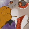
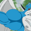
Oh! man what a good structure for the pose in which he is to lift himself, nice game of the red color for the shadings and the high lights areas, I like the head design, and I guess this is the first time that you draw feral reptilian foots, right? Another great work from you ^ ^


I think he's suppposed to do "chin-ups", since his feet are hanging free. But I've also mentioned this problem in my comment below, 'cause we cannot really see HOW the character is lifting his body (or not).
It is supposed to be a "pull up", yeah... "chin-ups"... but it doesn't really work, 'cause the body is too far away from the bar.
In fact, I would always try to get a photo reference of such things... I couldn't draw it from my mind, either. ^^"
It is supposed to be a "pull up", yeah... "chin-ups"... but it doesn't really work, 'cause the body is too far away from the bar.
In fact, I would always try to get a photo reference of such things... I couldn't draw it from my mind, either. ^^"


Positive Critique
In the past three artworks, you've kinda changed your shading/colouring style. It's now less "oily" or "glossy" than before... the characters always looked like being covered with litres of oil! ^^"
Don't get me wrong, I liked the style and the cool glossy effects VERY much! BUT I also like this change right here: softer shading, with blurry outlines and smooth gradients.
In fact, I'm neither sad nor displeased... I liked the glossy touch and I like this new touch. IN fact, it's great to see that you ARE ABLE to shade in a different way than before.
I dunno wheter you're going to keep the rather "less shiny" style now... but I just wanted to comment on this.
The great advantage about this smooth shading style (like shown here) is that the character's skin and body looks way more natural and soft. Also, you have quite less problems about the highlighting this way. The smooth shading really reminds me of watercolours or soft markers - and not oils or pastels (which the other style did).
Also, the line art and overall look benefits greatly from the smooth shading here. In fact, you can even add different levels of darkness in the shaded areas, which wasn't so easy in the glossy shadings. At least I think so. ^^"
In this particular artwork, you've added some sweat drops afterwards - and all these little drops would've been hardly noticable if you used the glossy, oily style! ^___^
So, this is another pro-argument for the softer shading technique.
Like I said: both ways are cool - but it's great to see that you move beyond the "comfort zone" and try something new.
Congrats!! ^^
Negative Critique
Muscles are good, anatomy (buff style) fitting... I do have only one aspect to point out here: what is Brunder doing?
I think you wanted him to do "chin-ups", correct?
But from the position of his arms and the angle of his arms... he seems to be BEHIND the bar, not below the bar!! It's a matter of distance and I admit this is darn hard to express. We can see what you wanted the character to do... but he's a little bit too far behind the seel bar. ^^"
And one other thing... I guess this is just a matter of personal style, but... it's bangning in the back of my mind: you never draw navels! :-O
I mean... some characters do not have them, alright. But plenty of your drawings are mammals and characters which originally HAV GOT a navel.
So, I'd really appreciate if you explain the reason to me. That'd be splendid. ^^"
I mean, this could be a matter of style... because I'm sure you DO know where to put the navel. I'd just like to know!
Keep it up and the current colouring/shading style is a welcome change!!!
I used to have those style in my picture, but less and less for now. :D But you can also occasionally see it in my picture. Thanks for the comment and critiques as well, I would like to say I just learn this workout so the pose was a little new for me, I made several mistakes, the arms should be, like you said behine but nor below, and his legs should be crossed too if not variant, about navel, I don't think that is necessary to put but it would be definitely add another detail to the picture that does more good than harm. Thanks again I apprieciated your comment. :D
ADDITION:
I just see something crazy!! ^__^" If you would add a bench below Brunder's body... this would be a perfect "bench press" artwork!!!!! ^__^
The view and angle looks really like if he's pressing up some weights.
Maybe, this is an idea for you for the next time... because such a view angle is REALLY something NEW!!


Comments