 FA+
FA+
316
Views
Views
9
Favorites
Favorites
Category
Artwork (Traditional) / General Furry Art
Species Lion
Size 798 x 1280
File Size 236.6 kB
Report this content
More from Zikaur
")
")
")


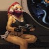
A pencil drawing I made of Jokanai tending to his mechanical leg. This was actually one of the many MANY ideas from my latest journal.
There is more that goes with this drawing, but as the page I drew it on is larger than my printer and I friggin hate taking photos in fake light, it´ll have to wait.
I also want to take a little bit of time and thank you all for your abundant feedback, it warmed my heart and I love y´all to bitsies! It´s awesome to see my watchers still active when something like this is involved.
Character © jokanai-henka
Art © zikaur 2012
EDIT: and as per usual, the scanner effed up the drawing, it´s so much smoother in real life. I´ll have to take some high quality photos someday.
There is more that goes with this drawing, but as the page I drew it on is larger than my printer and I friggin hate taking photos in fake light, it´ll have to wait.
I also want to take a little bit of time and thank you all for your abundant feedback, it warmed my heart and I love y´all to bitsies! It´s awesome to see my watchers still active when something like this is involved.
Character ©
 jokanai-henka
Art ©
 zikaur 2012
EDIT: and as per usual, the scanner effed up the drawing, it´s so much smoother in real life. I´ll have to take some high quality photos someday.
Category Artwork (Traditional) / General Furry Art
Species Lion
Size 798 x 1280px
File Size 236.6 kB


Really awesome drawing...
I see that I tend to add too much shades and shadows in the drawings. My friend told me once (years back) that adding a much bigger contrast between the two sides gives it a much more depth. Also that the highlights get much more emphisized.
But looking at this (and tons of other drawings) I see that the way I begin to draw a character is rather more intended for a cartoon looking one and not realisitic. Maybe using other technics at the very beginning will make the difference for me. But I'll try to stay with the cartoon style a little while longer.
A few questions:
Did you add an outline with a pen or are they just thick pencil lines?
On what paper size did you draw? A4?
If you ever need some help along the line you´re more than free to ask me, I´d be more than happy to help you out. ^^
The thick black line around the outside of the drawing is actually Ink that I put there with a crown pen. It was actually a slight disaster as the ink bled a little, but I had to soldier on forwards otherwise it would´ve looked weird.
And I drew this on a5 sized paper, apparently it´s fine toothed surface paper which is 89 g/m², but I usually just go for how it feels between my fingers. I always pick paper that isn´t too smooth, so has a bit of a grain and isn´t too thin. You want that lovely sound when you rub the paper between your fingers... the ehm... how to describe this... that jerky sound, it sounds a little bit like leather being stretched. You must know what I´m talking about.
Thank you VERY much for your offer. As always... ^^
- Now that you mention it, you can see some bleeding on some spots. But that makes it all the more fusier ^^
- Ahhh, A5. For me the most typical for sketches.
- And no I don't know what you are talking about... No, but seriously, I do understand. I got tons of different paper with different roughness. And the most fine I do also not use so very often.
Comments