 FA+
FA+
2781
Views
Views
186
Favorites
Favorites
Category
All / All
Species Unspecified / Any
Size 1280 x 1280
File Size 1.36 MB
Report this content
More from Fivel


very disappointed with the outcome.. but still had fun on it! =P
2nd painting, tried a slightly different approach. I don't think i'll really continue painting digitally for a while though.. i'll have to see.
BLEH.painting tips would be very very helpful!
comments and favs appreciated
2nd painting, tried a slightly different approach. I don't think i'll really continue painting digitally for a while though.. i'll have to see.
BLEH.painting tips would be very very helpful!
comments and favs appreciated
Category All / All
Species Unspecified / Any
Size 1280 x 1280px
File Size 1.36 MB


i can understand that. its still amazing and not all artist can pull off the colors and details you did either. your style is unique and your the only one who can do what you do. dont forget that and never give up on your art because its amazing to behold n.n


This is pretty solid! It's more successful than the orcy guy in some ways, and less in others. I think the fur texture is really great around the neck and head, but doesn't work as well down on the chest. A big chest poof looks great in lineart, but doesn't translate well to this lineless style, though I think it COULD with some work! Pose is good, colors are good. The background I don't like as much, and it might be the black over on the left side. I can tell you were toning down the brightness, but I think it could have worked better with complimentary colors rather than black, you know? The markings on the fur are stellar, both the darker stripes and the white areas. And those little blue symbols are great too! I like how the level of detail drops off down around his feets but they're still detailed ENOUGH. Though the level of detail in the head is extremely high and just, awesome and crisp and fantastic looking (I think you could offer painted ports/icons btw even now!) but you don't see that level of detail anywhere else on the figure. I think it's making my eye be drawn TOO much to the face? Like it's a good place for the eye to be drawn, but I dunno, I feel like it needs more balance in that regards. Even small things like defining the edges of the claws better may help. Sorry, I'm not being too coherent right now. XD; My main beef with the pic here are his clothes. They definitely don't blend with the rest of the pic, and feel pasted on. The figure has such a wide range of colors, but the cloth only has two that I can see: dark reddish and blackish (and green on the arm). I think they're too dark to fit in with the rest of the image, and with not enough of a range of color in them. I also think you could have emphasized more of the smaller folds, since right now there are only large sweeping areas of folds.
Phew, that was a big one. I hope it helps! I get a little nitpicky but I get the feeling you want some heavy crit, so! :) Overall it's a successful painting and you should feel proud!
Phew, that was a big one. I hope it helps! I get a little nitpicky but I get the feeling you want some heavy crit, so! :) Overall it's a successful painting and you should feel proud!
XD I definitely know what you mean about the face, it's definitely because I started the detailing on the face neck and arms and as i went further down i was like ..omg.. so sick of this!! which definitely is a mistake I can't ever make if i ever try doing trades/commissions of these types of things!
the clothes definitely were the biggest struggle because I coudln't figure out how to paint them on without them just looking blurry and weird, so I kept a selection mask around them which definitely makes them not look... natural XD I think if I can just figure out how to be able to paint two different textures (ie. fur against clothing) then i'll be able to make them look better in the end.
I also think an ongoing struggle will be finding a single way to make a painting, since i took a different approach to this than the 1st painting they have very different results. I don't want each painting to have such different quality/style changes so i'll have to find the technique i like the best and try to stick with it!! XD mostly it's just been blind trial and error for both.. I am surprised that they are coming out better than i initially expected but still! I feel like if i just be more patient with them they will come out a lot better.
THANK YOU so much for this comment :D I love critique a lot (on pieces that aren't commissions of course) so getting this really makes me happy and I will try to learn from my mistakes as best as i can ^^
(P.S the background was going to be a night sky with a full moon but it didn't quite work out.. so i got a little frustrated and just painted that bg XD i might go back and try to completely change it)
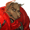


I think this is reallygood, and I think you a bright future in digital painting and should not feel discouraged. The central figure looks superb (the fur is beautifully rendered). My only possible criticism would involve the background, which looks tentative and does not quite set off the figure. That niggle aside, awesome job!


Comments