 FA+
FA+
242
Views
Views
6
Favorites
Favorites
Category
Artwork (Digital) / Fantasy
Species Unspecified / Any
Size 700 x 550
File Size 396.1 kB
Report this content
More from rileykek


redo of this picture http://www.furaffinity.net/view/4623552
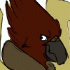
i suck at shading. there is nowhere to go from here but up!
i suck at shading. there is nowhere to go from here but up!
Category Artwork (Digital) / Fantasy
Species Unspecified / Any
Size 700 x 550px
File Size 396.1 kB

Ah, so it is, I don't check that place as much as I should anymore. Okay I'll give a few crits then!
Anatomy wise this is pretty good. The main thing that I see is that the dragon's wings are almost sort of on upsidedown, its the "thumb" that really throws them off, its bending in the wrong dirrection. Whenever you're drawing bat/hand based wings like these you have a convient reference attached to you, your own hands. Just mentally lengthen the fingers and they're perfect. Another distracting thing is the overall pose of the gryph, but its more an issue of physics. Given that he's completing a strong downstroke he should be currently going up, with his chest being the pull point (so everything else would resist the pull and drag behind, the further from the chest the more the part should be dropped), as such his back end should not be higher up than his front. If you wanted him to look like he's swooping it would be better to put his wings in a position that would allow a dive or would otherwise not create an upwards force originating from his chest (ie. wings somewhat folded next to body, outstreatched straight to the sides as in a glide, or raised prior to starting a downstroke to name a few posibilities).
As for the shading, you've done a good job of desaturating the colors to make this look like a nightime scene. The biggest thing to remember is that light has to have a source and the source determines the strenght of the lighting. With the rim lighting you have going (stong sharp lights and shadows) you'd need a fairly strong lightsource behind the character (like a large moon), but there is no lightsource of the sort to be seen. That sort of lighter section is not strong enough to cause that lighting.
One big thing to keep in mind when shading is that light is a form of ray. It cannot travel through an opaque substance to light forms behind it. It can travel slighting around curves, can bend and reflect, but it cannot go through opaque substances.
ie. --->| |
>|
The top object gets hit by the light and is light on its left side, but blocks the shape behind it from recieving any light, but the lower section of the object does get exposed to light (this is the general principle of cast shadow as well). This applies to backlighting as well which is in effect one big cast shadow (where the body is its own light blocker). Although there is a bit of consistency issue the light seems to be intended to be dirrectly behind the characters. The gyph's beak woudln't be as lit up as it is because of this, same with the spikes on the dragon, his fingers on his wing and his neck (the wing would be blocking a lot of light from hitting his face in general).
This a pretty nice step up from your previous picture and overall quite well done, good work!
Comments