 FA+
FA+
1456
Views
Views
11
Favorites
Favorites
Category
Artwork (Digital) / Doodle
Species Wolf
Size 1000 x 625
File Size 373.8 kB
Report this content
More from otakuwolf


Listed in Folders


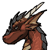
A wip of a picture i'm doing now as "color pratice".
Something i've learned is that tutorials can be handy to build up a style or learn new things, but you can't pretend to obtain the same result they show, a bit like that scene from "The family guy" in which Peter griffin was watching a painting tutorial on TV and he sayd "mine doesen't look like that, who cares" but despite that the result was good; the same is happening here where i'm trying to follow an "anime cell-shading tutorial" but although it doesen't look like the explaination i still like it and i think to have learned something anyway.
Something i've learned is that tutorials can be handy to build up a style or learn new things, but you can't pretend to obtain the same result they show, a bit like that scene from "The family guy" in which Peter griffin was watching a painting tutorial on TV and he sayd "mine doesen't look like that, who cares" but despite that the result was good; the same is happening here where i'm trying to follow an "anime cell-shading tutorial" but although it doesen't look like the explaination i still like it and i think to have learned something anyway.
Category Artwork (Digital) / Doodle
Species Wolf
Size 1000 x 625px
File Size 373.8 kB
Listed in Folders


I'm not sure exactly how, but I feel there is a lot of improvement :3. That's maybe the colour tones, or the pose, or whatever, but it really feels like something's been improved. Maybe it's because this picture is really close to the "three tone shading" i told you about back in the day; that you only allow 3 colours for shading a colour itself: normal, dark and light ^^, with a straight, cutting difference and not a smoothed gradient.

The big thing that I *think* I see here is more attention to shadows and highlights as opposed to color so much, as well as a general sharpening of those divisions. In fact, I see you've laid out some light theory in the picture too.
Something that helps me out is I tend to split my color layers-the most common setup I use is Body, Clothes, Markings. I find it a lot easier than having one color layer while I work, since I can overlay opaque layers on top of mistakes. For all I know you're doing that too and you just collapsed your layers, but still, something I find helpful.
Something that helps me out is I tend to split my color layers-the most common setup I use is Body, Clothes, Markings. I find it a lot easier than having one color layer while I work, since I can overlay opaque layers on top of mistakes. For all I know you're doing that too and you just collapsed your layers, but still, something I find helpful.
What is 'anime shading'? Anime is a very broad subject of Japanese animation which consists of many many different art style, and therefore lots of different ways to color and shade the art. For someone to say that there is a single method of 'anime shading' is a sign of a very narrow-minded person.


Comments