 FA+
FA+
392
Views
Views
9
Favorites
Favorites
Category
Artwork (Traditional) / General Furry Art
Species Raccoon
Size 1280 x 1028
File Size 291.1 kB
Report this content
More from sgolem


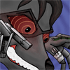
Haven't colored by hand in a little while. Critique would be great, specifically on the cloth, anatomy, and color.
Category Artwork (Traditional) / General Furry Art
Species Raccoon
Size 1280 x 1028px
File Size 291.1 kB


Ok, since you've asked for feedback I'll do what one of my instructors would do which is tell you all the positive things first about the piece before providing any criticism about it. One the characters look like they really are on watch for something or someone. Your fold and drapery of the garments is rather nice. Are their outfits based on any real world equivalants for culture or tribe? As individual figures the characters have some fairly strong poses and the perspective is holding up pretty well.
The areas that I'd liked to see strengthened are the pushing of contrast between light and dark in the both characters and the background. Keep the background at about the same same intensity but make the figures shadows and highlights stronger and more pronounced. Question, It appears that the coloring was done with color pencil with possibly some marker underneath? What is the working surface that the piece done on? With the figures, the standing one is pretty strong and could probably be left alone as is except for possibly moving his tail to avoid tangent collision with the seated character. The sitting figure I'd probably shift him over and down a tiny bit to further get him out of the standing characters tail. What I'm concerned about is the "telephone pole growing out of someones head problem". The two figures silhouettes overlapping and losing some of their visual punch in the process. Also I'd lower the seated figures tail just a pinch to avoid tangent that is occurring between his muzzle and the tail. Finally his head is not as solidly anchored to his body as the standing figure is. While this may sound like I'm really ripping this apart they are actually very small tweaks and adjustments to remember for future pieces, and I encourage to keep working at it.
The areas that I'd liked to see strengthened are the pushing of contrast between light and dark in the both characters and the background. Keep the background at about the same same intensity but make the figures shadows and highlights stronger and more pronounced. Question, It appears that the coloring was done with color pencil with possibly some marker underneath? What is the working surface that the piece done on? With the figures, the standing one is pretty strong and could probably be left alone as is except for possibly moving his tail to avoid tangent collision with the seated character. The sitting figure I'd probably shift him over and down a tiny bit to further get him out of the standing characters tail. What I'm concerned about is the "telephone pole growing out of someones head problem". The two figures silhouettes overlapping and losing some of their visual punch in the process. Also I'd lower the seated figures tail just a pinch to avoid tangent that is occurring between his muzzle and the tail. Finally his head is not as solidly anchored to his body as the standing figure is. While this may sound like I'm really ripping this apart they are actually very small tweaks and adjustments to remember for future pieces, and I encourage to keep working at it.
This is exactly what I need. You have my permission to rip it apart all you want. I've been drawing enough to know the difference between what is good critique, or people being assholes or trying to find things wrong so they look important. Also, in the end I think good critique is far more useful to an artist than ego, anyway.
First, you asked about clothing. I'm not sure if this was a rhetorical question or not, but I just made up their outfits. Everything they're wearing is for a reason though, whether it's for cultural or practical reasons. I try not to put things there just for the hell of it in scenes like this.
You mentioned problems with light and dark. Yep. Out of everything, that's probably the thing I feel I have the hardest time with (admittingly, it's probably because it's the thing I hate practising the most :P). Thing is, I still have a hard time noticing when I need to have contrast, so it didn't really bug me until you pointed it out. The next thing I color (provided I remember to do so) I'm going to concentrate on giving a higher contrast than I'm comfortable doing, since what I'm comfortable with doesn't seem to be enough. Never hear of using stronger contrast of light and dark in the foreground either, so that's a great tip I'll have to try using next time.
When I colored this I wanted to do it in pencil, but I only had about 30 colored pencils and didn't have a lot of money. What I ended up doing was using different shades of gray markers I had from a previous project underneath it to see if I could compensate for the lack of different colors. Didn't work as well as I planned, but still had some cool results, such as the somewhat of a bronze color the character on the right has on his vest. As for the working surface, it was done on regular computer paper. My "sketchbook" is often a clipboard with computer paper in it, since I like the freedom of being able to take things out and put them back in. Usually project like this I do on other types of paper, but thinking back, I think I did it on this because I was originally going to color it in Photoshop, but another artist inspired me to try using pencils instead. Still, the paper I used seem to work well for me. Anyway, I guess I should take a hint and list the materials used in the description from now on.
I've never heard the term, "telephone pole growing out of someone's head", but it's one I'm going to use in the future. This is one of those things that didn't look right, but went ahead and did anyway since I wasn't sure what to do in this situation. Essentially, inexperience was a factor here, so you're a big help in this area. The next time I have trouble with two characters like this I'll probably turn to this critique again, since you've essentially highlighted options for situations I struggle with all the time.
The only thing I'm having trouble seeing is what's wrong with the sitting figure's head. Maybe it only looks right to me because I drew it.
Thanks again. This was a huge help. I really appreciate your time.

Comments