 FA+
FA+
589
Views
Views
14
Favorites
Favorites
Category
All / All
Species Unspecified / Any
Size 696 x 461
File Size 443.1 kB
Report this content
★
More from Thornwolf


Noh concept sketches
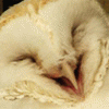
I got envious of people's "critter with mask" characters so I decided to make my own. Kind of boring really. I'm really bent for kitsunes so oh my gosh, a kitsune wearing a mask! I call her Noh. And yes that is a kimono made of long hair. Crazy inexperienced kitsune, doesn't know what clothes are.
Category All / All
Species Unspecified / Any
Size 696 x 461px
File Size 443.1 kB


I always loved the Noh masks, especially the character you chose (I think its the "mother" mask of Noh theater?) That one in particular always has a creepy sort of edge to it I always thought. I think its because of this picture from the silent film "A Page of Madness" (or Kurutta Ippeji) http://wondersinthedark.files.wordp.....0/02/page1.jpg
Anyway, I like the line work of your sketches ^^
Anyway, I like the line work of your sketches ^^
I actually just kind of made it up, I really like Heian eyebrows and I'm not as well versed as I'm sure you are XD But that's pretty cool! Thank you :) It's been awhile since I sketched in my book, it was very relaxing.
Btw I tried to use your pastel powder method, but on watercolor paper. FAIL, oh wow, did it ever fail, would not recommend for watercolor paper unless there's something I'm missing. It couldn't spread on the toothy paper and it ended up all blotchy ;/ Will have to try again, but I admire your style quite a lot so I figured it was worth a shot to try a new medium.
Btw I tried to use your pastel powder method, but on watercolor paper. FAIL, oh wow, did it ever fail, would not recommend for watercolor paper unless there's something I'm missing. It couldn't spread on the toothy paper and it ended up all blotchy ;/ Will have to try again, but I admire your style quite a lot so I figured it was worth a shot to try a new medium.
lol Its fine. I only learned about the Heian period of Japan recently because I took a course in Asian art history a few semesters back. Since then, the work in the Heian period and the illustrations from the Tales of Genji were always striking to me.
As for the pastel dust, hm, I may know what you're talking about. If you tried it on a very toothy paper, it may not work as well as you've noticed, but also, if you worked on an un-tinted background, that too could have been the problem ^^;; The illustration board I work on is coldpress, so it still has texture, but having the tea stained background helps blend the colors a bit better. You don't get the blotchiness or the giant white gaps.
Did you scrape off the dust with an x-acto knife and apply it with a paint brush? :3
I actually did tea stain the paper, and did a watercolor stained one as well, to test it out on tinted backgrounds. I used an x-acto to shave off dust, as you said, and applied it with a paintbrush. I think the problem is that the paper (I used arches watercolor paper, comes on a block, don't know the weight but it's considerably toothier than illustration board) and that the dust couldn't spread very far without getting caught up in the tooth. I'm going to try it again, but yeah, if you get anyone saying "baww it didn't work" thaaaat could be an issue Going to try it on some smooth bristol, see what happens.
Ahh I see :/ Yea, I haven't tried it on anything else besides coldpress strathmore illustration board with a tinted background. I remember my first try though was pretty splotchy. Maybe you have to practice and develop the right kind of pressure. I'm trying to think of anything I do that makes it blend better...
Usually I do a sort of vignetting. I put the heaviest color along the edges of my taped border and work out (so the darkest color is against the edges and it blends in towards the figure/image, etc.) That's what I did with this one: http://www.furaffinity.net/view/6197190 The brush I use is this shape, and I believe a little smaller than a half inch across: http://stores.homestead.com/Rock-Th.....H_DISCOUNT.JPG It also helps too to have a kneaded eraser to pick up any splotches, or help blend it out better.
Usually I do a sort of vignetting. I put the heaviest color along the edges of my taped border and work out (so the darkest color is against the edges and it blends in towards the figure/image, etc.) That's what I did with this one: http://www.furaffinity.net/view/6197190 The brush I use is this shape, and I believe a little smaller than a half inch across: http://stores.homestead.com/Rock-Th.....H_DISCOUNT.JPG It also helps too to have a kneaded eraser to pick up any splotches, or help blend it out better.

Comments