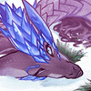
I dont know why I went so far with this. I miss the lovely blues and greens of the previous version, but the client called for reds and greys. Backgrounds aren't that hard to make, not that this is a good example, but I have always anxious to go that extra mile. (I was working straight through it without thinking and cursing myself the whole way. shwas funny.)
This has seen maybe three different color schemes. You can still see little bits of blue here and there...a couple places where the flesh is too dark or too light. Crits are appreciated, but this image is done.
It was a nice jumping point and I'm happy have finally paid tribute to my first character/imaginary friend.
Category Artwork (Digital) / Fantasy
Species Dragon (Other)
Size 1280 x 1161px
File Size 118 kB
I have enjoyed seeing this in progress and just, wow, it looks absolutely amazing. Every scale-plate, every little nick . I love the atmosphere of the background SO MUCH , It just gives me weird pleasant feelings like whenever I am in love with scenery.
Crit though... hmm... I have never taken art theory and not very good at putting things into words professionally or knowing how to properly analyse, but what I can say is that I think there needs to be stronger and sharper highlights in the dragons face and upper body in general that is closest to the viewer, to help it pop out a bit more. Or anything else to help it pop out more in that area. I think more highlight is all that it needs though, but that is just my own opinion. I can see some white highlight in a couple of the scales on the head but not anywhere else.
Crit though... hmm... I have never taken art theory and not very good at putting things into words professionally or knowing how to properly analyse, but what I can say is that I think there needs to be stronger and sharper highlights in the dragons face and upper body in general that is closest to the viewer, to help it pop out a bit more. Or anything else to help it pop out more in that area. I think more highlight is all that it needs though, but that is just my own opinion. I can see some white highlight in a couple of the scales on the head but not anywhere else.

 FA+
FA+


Comments