 FA+
FA+
")


")


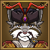
Updated and redesigned version of my logo! 4th iteration of it, this time simplified and looking less like a Euro symbol :P Previous v3 version of the logo can be found here https://www.furaffinity.net/view/21935400/.
As I've mentioned before, this logo is the emblem of the Wolf Alliance in my comic and original world. The original crescent shape and this shape are actually of the same objects. The larger object being the 2nd planet known as Duvaria in the binary orbit with the planet the comic takes place on. The smaller object in the middle being a moon that orbits the main planet and occasionally causes an eclipse, though only a partial eclipse as it is not very large. Then the 3 claw marks represent the 3 races that make up the alliance, the canines, the felines, and the 3rd has been debated but some think it represents the mysterious Vaal elves and others the hyenas.
As I've mentioned before, this logo is the emblem of the Wolf Alliance in my comic and original world. The original crescent shape and this shape are actually of the same objects. The larger object being the 2nd planet known as Duvaria in the binary orbit with the planet the comic takes place on. The smaller object in the middle being a moon that orbits the main planet and occasionally causes an eclipse, though only a partial eclipse as it is not very large. Then the 3 claw marks represent the 3 races that make up the alliance, the canines, the felines, and the 3rd has been debated but some think it represents the mysterious Vaal elves and others the hyenas.
Logo ©2025 titusw. All rights reserved.

titusw.net | Clip Studio Paint EX | My Art Tools
Category Icons / Miscellaneous
Species Unspecified / Any
Size 960 x 960px
File Size 166.6 kB

Comments