 FA+
FA+
1512
Views
Views
131
Favorites
Favorites
Category
All / All
Species Unspecified / Any
Size 900 x 695
File Size 363.2 kB
Report this content
★
More from Thornwolf


Werewolf Calendar Sketch
EDIT - No more crits please! It's already almost done. I've changed some things as per your suggestions in the final, thank you for your input, I really appreciate it :D
I'm transferring this to watercolor paper on Saturday so if you have any critiques or redlines, I'd really really love them before then! :D Please be mindful I am looking for glaring errors like "hey that hand's backward" or "his bicep needs work, let me redline that for you" not "redo the whole composition" type things because..dude..this took me three days. Please be mindful of your critiques, "looks wrong" doesn't help me at all D:
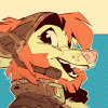
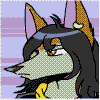
This is my sketch for the Werewolf Calendar project. Here we have Norse/Celtic/Pictish werewolves painting and dressing a champion who will defend their tribe in battle. They ceremoniously adorn him on a stone altar amongst foggy carved monoliths.
This is sort of a prequel to my "Warrior's Vigil" bookmark design in my main gallery.
I'm transferring this to watercolor paper on Saturday so if you have any critiques or redlines, I'd really really love them before then! :D Please be mindful I am looking for glaring errors like "hey that hand's backward" or "his bicep needs work, let me redline that for you" not "redo the whole composition" type things because..dude..this took me three days. Please be mindful of your critiques, "looks wrong" doesn't help me at all D:
This is my sketch for the Werewolf Calendar project. Here we have Norse/Celtic/Pictish werewolves painting and dressing a champion who will defend their tribe in battle. They ceremoniously adorn him on a stone altar amongst foggy carved monoliths.
This is sort of a prequel to my "Warrior's Vigil" bookmark design in my main gallery.
Category All / All
Species Unspecified / Any
Size 900 x 695px
File Size 363.2 kB


Thank you for mentioning it. I was kind of wondering about that, but wasn't sure if it was my imagination or not, looking at it now I think I have an idea of how I can tweak it a bit. This is why I wanted to give it two days before I committed, both to gather crits and also walk away from it and come back XD


The wolf plaque is intended to kind of tie together the previous image with this one in that its the same image, and intended to bring the eye upward. The belt, however, I could omit. I had put it there with the thought that it would bring more of a "they're dressing him" feel to it. Too much?


I love the piece! I love the concept and it looks really fantastic so far. If I had to say anything, I think it would be borderline opinion? so take it or reject it how you like.
I feel the wolf on the far left working on the center-wolves paw..his right thigh looks rather strained and stretched...I would feel it would give that wolf more grounding/weight if that knee was brought forward just a tad bit more, NOT ALOT!. Just enough to where I would feel like those muscles aren't straining to keep that thigh so open like that...
Gosh that's it! Sorry! Just a weird comment :D

I like this image a lot ... there's not much to critique. The anatomy and perspective overall look good to me...
I will however second the comment on the belt - I like the idea of it, narratively, but maybe it looks a bit too modern? Maybe its also because its drawn all in black, but the belt doesn't seem to have depth (the ripples don't have an apparent side edge or underside)
I also wonder if there will also be designs/carvings on the inner 2 monoliths. (I really like those stylized designs!)
Excellent work, I look forward to seeing it when its done =D!
On the monoliths theyre going to be kind of foggy so if there's any carvings they'll be very faint. I was concerned about making everything "too busy". This is the type of environment I'm going for, for reference: http://www.ancientstones.org.uk/ima.....urlers_250.jpg
As for the belt, I'm thinking of omitting it. It was (haha, obviously) a last minute inclusion and I figured I'd flesh it out once it was put on the watercolor paper, but I'm not certain its needed either. Its a callback to the style of belt in the previous pic, but unless its on someone it looks kind of weird.
Thanks for the input!

This is just gorgeous. You've gotten a lot of good feedback critique so far, so I feel that anything I could point out would be nit picky. XD I agree with the sentiments about the belt, and you could go two ways about it: it could be made less modern looking or taken out entirely. I do like the narritive quality of having an item of clothing laying unworn though. =)
The only other thing I can see is that there seems to be a tangent line created by the wolf sitting indian-style to the viewers right. The line is sitting between the curve of the tail of the center most wolf. The placement for that part of the right sitting wolf's leg looks correct, just the boldness of the line throws off the angle of the tableu the centermost wolf is standing on. You should be okay as long as that line is subdued in the finished piece.
That being said - WOW. You've really outdone yourself (and that's saying something!!).
Ah is it a perspective thing with the way the center wolf's tail is curling on the table, makes it look like it's falling /off/ the table at an unnatural angle that doesn't agree with the perspective? Is that what you mean? Would changing the angle of the tail (make it fluffier, raise it up a little bit) help that?
Thanks!
Thanks!
Oh no, that's not what I mean. Here's a quick redline: http://imageshack.us/photo/my-image.....redlinedq.jpg/
Just the line that I circled is creating a focal-point tangent that I didn't know you desired or not. If the line is going to be subdued in the final piece I think it will be fine. It's just conflicting with the angle of the back side of the tableau.
Just the line that I circled is creating a focal-point tangent that I didn't know you desired or not. If the line is going to be subdued in the final piece I think it will be fine. It's just conflicting with the angle of the back side of the tableau.
It is, but what she's saying is that compositionally that line that the leg makes creates an odd tangent, like an arrow that points into a direction that we do not want to focus on and is not the focal point of the image. By omitting it, there will be nothing to detract the eye into a false path. Something like that. I understand it more than I can explain it. XP

I love this! The only thing that caught my eye was the very left werewolf, I think there is something going on with the left eye - the distant one. Seems almost too close to the right eye. Do you see what I mean?
The one on the right, "Dude, you're so badass. Let me just add a few finishing touches... yep.. a dot here... perfect."
The one on the right, "Dude, you're so badass. Let me just add a few finishing touches... yep.. a dot here... perfect."

I love the runic letters on the table that's showing that the wolves are Scandinavian! I have always love that part of lore because it seems that everyone puts them as a Native American "thing" if you will. Overall I love this pic, anatomy and background. Just waiting for color I guess. =^.^= hopes to you!


The neck on the center wolf may be a little too long? Or maybe it's something about the plane of his face/ears with respect to his neck and body that's throwing me off. It may just be that some of the sketch lines on his left (our right) cheek fur are clashing with those defining his neck and throwing off my sense of perspective. I would need to sketch over this to prove or disprove my thinking. I'll do that if you don't respond before I get a chance.
Awesome work, I look forward to seeing it finished :)
Awesome work, I look forward to seeing it finished :)
I also sketch very messily >_> I intend usually to have my werewolves have more animalistic necks and his hackles might be throwing stuff off a bit, but his chest is not as defined in the sketch because its one of those "when I put it down on paper I'll know what I'm doing, to hell with this sketch I'm done" sort of things XD But yeah there's some extra cheek fluff there that likely won't be there in the final, which may help the perception of anatomy a bit better.


There needs to be so much more art like this.
I especially love your smaller details. The Mjölnir one wolf wears and the Þurisaz rune the other wears, as well as the runes along the bottom. The entire picture is just so awesome! The concepts on the shields are amazing too.
Sorry I don't really have any critique. xD
I especially love your smaller details. The Mjölnir one wolf wears and the Þurisaz rune the other wears, as well as the runes along the bottom. The entire picture is just so awesome! The concepts on the shields are amazing too.
Sorry I don't really have any critique. xD
Well, to be perfectly honest, I can't
really see anything with this piece, so
far. The composition works great.
I'm not sure whether or not this is
a genuine niggle, and I'm aware that
this is a WIP, the detail on the warrior's
hand seems to me to be a little indistinct.
really see anything with this piece, so
far. The composition works great.
I'm not sure whether or not this is
a genuine niggle, and I'm aware that
this is a WIP, the detail on the warrior's
hand seems to me to be a little indistinct.

I'd say probably work on the expression on the middle fellow's face. While the other two are clearly thinking about something and interacting, the middle fellow is just staring blankly. It might help if he was either looking at them or, if the expression is meant to be contemplation, considering the body language and facial expression used by canines and humans when they're thinking deeply about something.
HA! I found something. Middle-guy's calf part of his leg is a little too long...when you squat like that, you should "kick" yourself at the base of your butt. I think it would be even more akward for a digitigrade individual to have the calf long.
Just a thought! Obviously not incredibly noticeable!
Just a thought! Obviously not incredibly noticeable!


OK, so it's a LITTLE bit past your Saturday deadline, but I did notice one problem - it looks to me like the main wolf in the middle is kind of intense, and maybe a little angry. So, he just really needs to work though those feelings, or it's eventually going to effect his health. I'm just sayin'.
This is super cool! I love it!
This is super cool! I love it!
Comments