 FA+
FA+
574
Views
Views
33
Favorites
Favorites
Category
Artwork (Digital) / Fantasy
Species Unspecified / Any
Size 600 x 1024
File Size 260.5 kB
Report this content
More from Excess-0


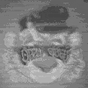
This was.... wow. Just... this commission kicked my ass down the block and back. It's the first time in a long time that I have been this challenged by... well, by anything. So I mean, as much as I really lost money on all the time I spent sketching and re-sketching this, I learned a lot from it. So for that, I really owe  methados a huge thanks for commissioning me to do this for him. :D It was as much awesome fun, as it was hair-pullingly frusterating.
I hope I did the character justice(he's such a freaking awesome character), and I hope this is the kind of thing that you were looking for, because I know you asked me to redesign it a bit... I'm just never sure if I got it perfect. Obviously I like it or I wouldn't consider it finished, but I hope you like what I've done with it too. :)
Idhe 'Temotee "Project 37" belongs to methados
Go give him some love, because he's a pretty talented bro. <3
On a side note: This is how I'm going to be painting my fully shaded pieces from now on. Feel free to give me some feedback on what you think of it, because it's a very new thing I'm trying.
 methados a huge thanks for commissioning me to do this for him. :D It was as much awesome fun, as it was hair-pullingly frusterating.
I hope I did the character justice(he's such a freaking awesome character), and I hope this is the kind of thing that you were looking for, because I know you asked me to redesign it a bit... I'm just never sure if I got it perfect. Obviously I like it or I wouldn't consider it finished, but I hope you like what I've done with it too. :)
Idhe 'Temotee "Project 37" belongs to
methadosGo give him some love, because he's a pretty talented bro. <3
On a side note: This is how I'm going to be painting my fully shaded pieces from now on. Feel free to give me some feedback on what you think of it, because it's a very new thing I'm trying.
Category Artwork (Digital) / Fantasy
Species Unspecified / Any
Size 600 x 1024px
File Size 260.5 kB

The shading looks good; I especially like the teeth, the muscles in the arm, and the highlights on the boots. They have a good sense of depth. The folds in the trousers are nicely done, too - the shading is minimal, but makes it clear that it's cloth.
The whole thing seems a bit dark overall, though. There's not a lot of contrast. I'd expect there to be parts that are as bright as the background, especially since there's so much metal and smooth skin; it seems like there should be more bright highlights like the ones in the eye. As it is, it looks like either all the surfaces are fairly dull, or he's standing in shadow with a bright light behind him... in which case I'd expect more light from the back. The strongest contrast is between him and the background, which makes the shading less effective. Other than that, though, it's quite well done. I think it might help to increase the contrast somehow, but that could be as simple as changing the background to a dark color instead of white.
I look forward to seeing where you go with this technique!
When I was working on this, I was very tempted to give it a nice, dark background. It wasn't requested, so I just... left it white. I kinda wish I hadn't.
I'm a fan of darker, moodier stuff when I paint, with pretty minimal contrast, so when I painted this, I think I made the mistake of going too dark with the character. I think you're probably right about the highlights... I should have included the white background as part of the image, rather than ignoring it, yeknow? Thanks for your critique! I'm gonna keep all the feedback in mind when I work on future commissions.
The technique still needs a lot of practice and work, but I think there's real potential in it! :D


I think you're probably right about that. It needs more distinct highlights or something, on top of what I've got. It was hard for me to decide, when I did this, where the light was coming from and how much of it was reflected off of the white background.
I tend to ignore white backgrounds, and I think that was my biggest mistake here. It could use some more stark highlights, and maybe another layer of deeper shadows.
Thanks for your feedback! I appreciate it! :D
I tend to ignore white backgrounds, and I think that was my biggest mistake here. It could use some more stark highlights, and maybe another layer of deeper shadows.
Thanks for your feedback! I appreciate it! :D
Comments