 FA+
FA+
163
Views
Views
2
Favorites
Favorites
Category
All / Portraits
Species Horse
Size 1280 x 960
File Size 242.8 kB
Report this content
More from Pom-pom poodle


not too bad, and a good way to get back to my drawing
i fulfilled his requests, so, yeah. comments?
i fulfilled his requests, so, yeah. comments?
Category All / Portraits
Species Horse
Size 1280 x 960px
File Size 242.8 kB

Love it angelo! Thank you so very much ^_^
Actual critical review (Dont think me harsh, just things to point out for you to work on for future ones even if I love this one a lot!)
CONS:
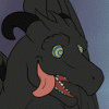
Linear: ALmost all the lines are kept to but there are a few mistakes, such as marker going outside the lines, not harshly on this so it isnt a big deal, but something that could be for someone else/on a more important piece.
Coloring: The nose is a bit too dark, a soft pink would have been better, but the point is made. (This would be my 'least favorite' part of the picture, but I love the picture anyways!)
Shaping: The ear comes to a point going into the head, should taper at the bottom a bit, but not come to a point.
PROS:
The muscle/toning you have done here is actually rather well done. Most people have trouble with this touch! Such as neck stripe line and jaw line.
The color isnt overwhelming in the picture. I mean this in an odd sort of way. Yes the color should be prominent, but the hair for example benefits, in my opinion from having the whiter spots for shading/pulling out individual strands of hair, the style at least.
The small smile is a nice touch!
OVERALL: 7.0 out of 10.
FINAL COMMENTS:
Angelo, this piece is great, and it means a lot, thank you so much. My rating is based on my own personal feeling towards it and should no reflect anyone else. Please dont think me harsh, I only provide these points to help you grow into the best artist you can be.
FINAL VERDICT: Simply beautiful, thank you once again hun, one hundred percent a pass!
Actual critical review (Dont think me harsh, just things to point out for you to work on for future ones even if I love this one a lot!)
CONS:
Linear: ALmost all the lines are kept to but there are a few mistakes, such as marker going outside the lines, not harshly on this so it isnt a big deal, but something that could be for someone else/on a more important piece.
Coloring: The nose is a bit too dark, a soft pink would have been better, but the point is made. (This would be my 'least favorite' part of the picture, but I love the picture anyways!)
Shaping: The ear comes to a point going into the head, should taper at the bottom a bit, but not come to a point.
PROS:
The muscle/toning you have done here is actually rather well done. Most people have trouble with this touch! Such as neck stripe line and jaw line.
The color isnt overwhelming in the picture. I mean this in an odd sort of way. Yes the color should be prominent, but the hair for example benefits, in my opinion from having the whiter spots for shading/pulling out individual strands of hair, the style at least.
The small smile is a nice touch!
OVERALL: 7.0 out of 10.
FINAL COMMENTS:
Angelo, this piece is great, and it means a lot, thank you so much. My rating is based on my own personal feeling towards it and should no reflect anyone else. Please dont think me harsh, I only provide these points to help you grow into the best artist you can be.
FINAL VERDICT: Simply beautiful, thank you once again hun, one hundred percent a pass!
i don't think you harsh. i admire how much thought you put in your critisism, i'll adress your issues.
1. linear : i have kinda shanky hands, and have dyspraxia which means i'm not great at lines, but, this is the best i could manage.
2. colouring: my pink pencil refused to show up on the camera, it looked white and mixed with that stripe, so i improvised.
3 shaping : well, i must have missed out that detail, but i believe the final look is suitable.
thanks for the comments, spread the word about me, and i'm ALWAYS open to draw anything you like

Comments