 FA+
FA+
925
Views
Views
15
Favorites
Favorites
Category
Artwork (Digital) / Doodle
Species Dragon (Other)
Size 469 x 725
File Size 181.4 kB
Report this content
★
More from Noben


"Summer of 6988" Cover Sketch
Insta-scraps.
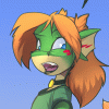
My first super quick run at making an actual COVER to the next comic arc over at Altermeta. This might not be even close to the final product, but I do like the potential behind it. If anything I might be able to turn this into a snazzy poster and use something totally different as the cover. (I got a couple of other ideas in mind)
The shape of this pic is also closer to the resolution the next comic arcs are going to be in. More of a proportion similar to the 11x17 ratio of comics, which will give a lot more vertical room for expansive, expressive scenes and seemingly more area for panel work.
Also, Sasha butt. It is super girly.
Category Artwork (Digital) / Doodle
Species Dragon (Other)
Size 469 x 725px
File Size 181.4 kB


Heh heh, Iknew folks would get that.
But the thing is, that IS the year that the comic is currently taking place in: http://altermeta.net/archive.php?comic=31
And yes, lol at the tags. Cuz I know it makes peoples brains hurty. ^___^
But the thing is, that IS the year that the comic is currently taking place in: http://altermeta.net/archive.php?comic=31
And yes, lol at the tags. Cuz I know it makes peoples brains hurty. ^___^

Sketched in SAI, yeah.
This was what was done totally in SAI with only a kiss of photoshop: http://www.furaffinity.net/view/5612056
This was what was done totally in SAI with only a kiss of photoshop: http://www.furaffinity.net/view/5612056
Heh heh! You're not the only one that says this. I've seen many a folks get their knickers in a twist (like as THE reason to think my comic sucks) because of how I draw him.
I may have to fix some of the proportions in the final picture. He's looking really bottom heavy more than usual due to the angle of the image itself. It's kind of a fisheye, but below the waistline view upwards. This is just the general idea so far.
I may have to fix some of the proportions in the final picture. He's looking really bottom heavy more than usual due to the angle of the image itself. It's kind of a fisheye, but below the waistline view upwards. This is just the general idea so far.


Eh, kind of. I don't do it very often. The different colours helps certain things stand out that need to be highly edited. And yes, are on their own layers. The pink was the whole body, minus tail and hair. It was pretty much just how I liked it, so it became a static base for everything else to attach to and flow off of.
The blue was for the hair alone, changing it around from either tied up to let down in the rain. The tail was on it's own layer and green because I wanted to have it maneuver just right so that it won't obstruct too much. (like the well liked/loathed Sasha butt)
The blue was for the hair alone, changing it around from either tied up to let down in the rain. The tail was on it's own layer and green because I wanted to have it maneuver just right so that it won't obstruct too much. (like the well liked/loathed Sasha butt)
Comments