 FA+
FA+
2664
Views
Views
126
Favorites
Favorites
Category
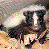
Artwork (Digital) / General Furry Art
Species Skunk
Size 500 x 750
File Size 127.1 kB
Report this content
More from Norithics


Yeah, that's right. I signed this. I actually signed a piece of artwork. Why? Because it came out exactly how I pictured it.
This was cathartic. EFFORT! <3
Lisa Frank coloring was frut's fault for reminding me how much I wanted that stuff when I was a little boy.
Also, I'm pretty sure every therapist is required to have a 'hugs' sweater.
This was cathartic. EFFORT! <3
Lisa Frank coloring was
 frut's fault for reminding me how much I wanted that stuff when I was a little boy.
 Also, I'm pretty sure every therapist is required to have a 'hugs' sweater.
Category Artwork (Digital) / General Furry Art
Species Skunk
Size 500 x 750px
File Size 127.1 kB


Woah, this looks really cute and colorful, I like it! Although I personally think that Lisa Frank's colorful style can be sort of a mess. Like, she knows how to pick some really good colors, but her art doesn't have any sort of consistent lightsource or shading or color balance to it. I really like how colorful it looks, but sometimes it just looks too dirty and ugly.
http://s2.thisnext.com/media/larges.....n/548FDCEA.jpg Like this, why is one of the legs so blue and have such a big contrast? Why is the tail also like that? Why is the face much more brighter than the rest of his body? He looks like he's under strong yellow and blue color influence, and the sky at his back also looks like that, but the rest of the background isn't!
http://sexyfresh.com/blog/wp-conten...../202939068.jpg this looks great in counterpart! It does fall to some of those mistakes - lack of lightsource and some dirtyness and all, but it does have a nice thing going on the background with the contrast of hot and cold colors there, and it looks pretty good overall.
I think it's good that you're trying to strive for her sort of colors and colorful contrast between hot and cold, it looks really good there, but don't make your art dirty, lack a lightsource, and all those mistakes that Lisa Frank's art have (don't worry you didn't reproduce those mistakes here, but just in case!)


Comments