 FA+
FA+
613
Views
Views
13
Favorites
Favorites
Category
Artwork (Digital) / Fanart
Species Dragon (Other)
Size 2210 x 1080
File Size 1.3 MB
Report this content
More from Trix-Master


Listed in Folders


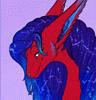
This was made and uploaded to twitter and a few circles at 1/5/2024. I am very aware they changing the face up to be more better textured. But even then, I want to upload this and also have some thoughts, some of which not plugged into the texture tweak.
Practically woke up to seeing Smolder and most of my complaints were on his face and so was everyone else's. Because we are tired of weird human face dragons like Sisu (no seriously why does she look like Elsa?) and landing into uncanny get away from me energy. New MLP kind of retooled their pony models for dragons and it sucks. Skylanders Spyro is still my least favorite Spyro design. There's so many pug faced digimon main dragons that it's like "Veemon idk 12" packaged and given. So you can tell by the insane ramblings of a mad lad, I'm tired, let babies have snouts or more pointy in general.
Obviously with the design I was willing to compromise with the snout, however with the champion team behind him wanting him to be "expressive", I feel they kind of failed on that aspect and I'm shocked they did considering the TFT team ran laps with their dragons. From the rotund Choncc to the more dragconic Burno.
How to fix the "expressiveless" in Smolder here, is to widen his mouth (he is not a horse so make him smile real wide) and give him much bigger eyes. Eyes are the gate ways to the soul after all. I will admit I went a lil digimon in the mouth and eyes. Because it seemed like the better route to do with a short nosed dragon. Like I rather a not Veemon than a uncanny scaleless homunculi child. I made the irises bigger to give him the more dragony vibes. I like that his eyes go from a blue to this green teal. Kept that. Also had his colors kind of gradient down to the blue a bit which made this mulberry like purple.
With the team revising his face I noticed that he does similar scutes, which is nice. While the short had him basically with no belly scutes. I'm gonna guess they thought the short model was done and it really wasn't or is fairly different to the art and in game models. Which happens. I mean happened to Warwick when his rework finally shined.
Hopefully the team behind him aren't too discouraged. We all have brain farts. If anyone is harassing them and using this as a thing to throw at them. Ya terrible, that's fucked. I just wanted to take my own lil swing at it, as all hand slips do. It's just a goober having big thoughts and that's all. See ya next art piece and it's going to be absolutely stellar.
Smolder (C) Riot Games
Art piece on the right (C) Trix-Master
Posted using PostyBirb
Practically woke up to seeing Smolder and most of my complaints were on his face and so was everyone else's. Because we are tired of weird human face dragons like Sisu (no seriously why does she look like Elsa?) and landing into uncanny get away from me energy. New MLP kind of retooled their pony models for dragons and it sucks. Skylanders Spyro is still my least favorite Spyro design. There's so many pug faced digimon main dragons that it's like "Veemon idk 12" packaged and given. So you can tell by the insane ramblings of a mad lad, I'm tired, let babies have snouts or more pointy in general.
Obviously with the design I was willing to compromise with the snout, however with the champion team behind him wanting him to be "expressive", I feel they kind of failed on that aspect and I'm shocked they did considering the TFT team ran laps with their dragons. From the rotund Choncc to the more dragconic Burno.
How to fix the "expressiveless" in Smolder here, is to widen his mouth (he is not a horse so make him smile real wide) and give him much bigger eyes. Eyes are the gate ways to the soul after all. I will admit I went a lil digimon in the mouth and eyes. Because it seemed like the better route to do with a short nosed dragon. Like I rather a not Veemon than a uncanny scaleless homunculi child. I made the irises bigger to give him the more dragony vibes. I like that his eyes go from a blue to this green teal. Kept that. Also had his colors kind of gradient down to the blue a bit which made this mulberry like purple.
With the team revising his face I noticed that he does similar scutes, which is nice. While the short had him basically with no belly scutes. I'm gonna guess they thought the short model was done and it really wasn't or is fairly different to the art and in game models. Which happens. I mean happened to Warwick when his rework finally shined.
Hopefully the team behind him aren't too discouraged. We all have brain farts. If anyone is harassing them and using this as a thing to throw at them. Ya terrible, that's fucked. I just wanted to take my own lil swing at it, as all hand slips do. It's just a goober having big thoughts and that's all. See ya next art piece and it's going to be absolutely stellar.
Smolder (C) Riot Games
Art piece on the right (C)
Trix-MasterPosted using PostyBirb
Category Artwork (Digital) / Fanart
Species Dragon (Other)
Size 2210 x 1080px
File Size 1.3 MB
Listed in Folders

His design was definitely a bit weird, he really does need to good proper snout. I noticed there was a little of one in one of the art works of him, which did make him look a bit better there.
I don’t mind Sisu‘s design that much myself. The only thing that felt off was the unicorn like horn. Though slit pupals like most dragons might have made it better.
The new mlp dragons were a bit odd as well. I do think that they could have looked good. There are a few shots of some of there heads that show that. A lot of their oddness comes from their more pony like legs and marks from what I have seen. Spike just feels weird all round though.
He does have a snout. It appears that not only the artwork shows it more but also the in game model (With and without the recent tweaks). From what I have gathered, it's strictly an issue with the animated short's model because if you look closely at both the tweaks post from Riot staff and the short. Smolder in the short doesn't have belly scales. So I'm wondering what went wrong there.
I mean, you do you. If you like Elsa face with a snout that's fine. There was a fair hand of concept art that made her design a lot better including different set of eyes. But you know Disney refuses to have the balls to be scary or creative so... Obviously it stayed in concept art.
The new MLP dragons are literally like that, because they did just take pony models and tweaked them. You can tell with the poses and animation. 100% solely to save on money because the usage of Spike probably broke the budget of 3D animation there. I do not like them at all. Literally if they were Kirins I would be generous enough to let them pass.
mhm. i have seen a screen shot of his updated design, which looked better. i will have to get around to looking into the changes more. (the snout is still very small though)
don't think i have seen any of her concept art, that sounds like it would be interesting to look up. i do remember that some of the fan art does look better than the movie as well.
From what i have seen, a lot of people seem to think Disney has been going down hill for a while now.
there seems to have been a lot of problems with the new MLP. never crossed my mind that they just edited the pony models, but i can see that a bit now that you mention it.
i think i would almost go the other way around with that; the original show gives me a certain impression of kirins from it, which i don't think the gen five dragons fit at all, even with all the pony like features. even if they don't do it well, i think they fit dragons more.
Comments