 FA+
FA+
1139
Views
Views
199
Favorites
Favorites
Category
Artwork (Digital) / General Furry Art
Species Unspecified / Any
Size 765 x 816
File Size 105.8 kB
Report this content
More from Speed


I'm nervous about this. A lot. I was experimenting with a coloring style that I thought would go good with the pirate theme.. Make it look old and almost like it was on parchment or something with the way it was shaded.
Just wanted to make my half of the trade as awesome as Bricket's half, cause I loved the pic of me that she did.
Alright. Hope you love. ;_;
Bricket © bricket
Image/Coloring © Me
Just wanted to make my half of the trade as awesome as Bricket's half, cause I loved the pic of me that she did.
Alright. Hope you love. ;_;
Bricket ©
 bricket
Image/Coloring © Me
Category Artwork (Digital) / General Furry Art
Species Unspecified / Any
Size 765 x 816px
File Size 105.8 kB


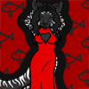


EEEEEEEEEEEEEEEEEEEEEEEEEEEEEEEE!!! I looooooooove eeeeet! I love how you've taken parts of the fur color and added them into the outfit; the whole ensemble just GOES together!
And you're right: The main marking color *is* black with purple highlights, but I like the color flow with this! Thank you so much! <3<3<3<3<3<3<3<3
And you're right: The main marking color *is* black with purple highlights, but I like the color flow with this! Thank you so much! <3<3<3<3<3<3<3<3


I think the effect would have been enhanced if you had laid in a flat background wash in a sepia tone. Teabags are great for that effect:) If you still want to try it, and risk possibly bleeding the markers, you could lightly crumple the drawing and soak it in tea. The tea will stain the wrinkles darker than the flat areas, gives it a neat aged look. You could even tear/burn the edges a bit :)
Or is this colored digitally? I still reccomend getting in a nice sepia background, so the eye wont strain to see such vivid, pretty colors against stark white. Also, you might try pulling the colors together by say, shading the red and yellow with some of that purple, working some browns into the reds and vice versa, and maybe adding some lighter yellowy highlights throughout. Will help tie all the colored patches into a cohesive whole.
Hope you don't mind the critique, it's a very lovely image, the linework is fantastic and i do really like the pallete!
I don't mind the critique. It's actually a mixture of traditional and digital coloring. I would have done the whole thing in sepia if I didn't want the bright colors to actually show. The purples and reds in her character are so vivid that I /wanted/ them there. If I aged it all with a sepia tone, that would be lost.
Besides. XD Why not blind my fans? XD
Besides. XD Why not blind my fans? XD
what program did you use to color this?
If it's in photoshop, it shouldn't be too difficult. If it's Opencanvas, it's a pain in the ass (you put the bg color on a new layer and then have to go in and erase it from inside the character outlines. In a piece like this where there are so many pointy bits, its a major hassle)
If it's in photoshop, it shouldn't be too difficult. If it's Opencanvas, it's a pain in the ass (you put the bg color on a new layer and then have to go in and erase it from inside the character outlines. In a piece like this where there are so many pointy bits, its a major hassle)


Comments