 FA+
FA+
4747
Views
Views
443
Favorites
Favorites
Category
All / All
Species Unspecified / Any
Size 1414 x 1233
File Size 423.9 kB
Report this content
More from rickgriffin


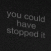
Did an ink test over the weekend to see if I could actually do the strict black/white no-halftone style I wanted for the INA comic. This is hard!
Posted using PostyBirb
Posted using PostyBirb
Category All / All
Species Unspecified / Any
Size 1414 x 1233px
File Size 423.9 kB
Oh. I figured it was the physical color gray you didn't want. I was thinking a field of black dots could imitate the look of gray/halftone without technically actually being a different tone. Like stippling or something. Is hatching a kind of halftone? You could try hatching+crosshatching. But then I may be misunderstanding what you mean by "strict black/white no-halftone".
Regardless, like I said, this looks great.
Regardless, like I said, this looks great.
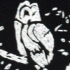


Frank Miller popularised this look with Sin City, but he did crib an awful lot from Jose Munoz and Alex Toth.
Mike Mignola used to use some great solid black in his art, but that was mostly with colour.
I think sometimes they'd paint the whole page black and then scratch away the ink with a razor. I guess you need a sturdy paper stock for that. Sometimes they'd paint in white ink on top. I think I've heard of publishers complaining that art like this would use up all the ink and be more expensive to print, lol.


Comments