 FA+
FA+
243
Views
Views
4
Favorites
Favorites
Category
All / All
Species Vulpine (Other)
Size 800 x 704
File Size 308.7 kB
Report this content
More from ozinec


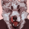
Give me some critique! I like what's going on, but any help would be appreciated!
I'm thinking this will be my main character, it's been "grey colored fox/wolf/dog" for too long.
I'm thinking this will be my main character, it's been "grey colored fox/wolf/dog" for too long.
Category All / All
Species Vulpine (Other)
Size 800 x 704px
File Size 308.7 kB


The one i have in mind is that there will be a thick circle on his body.
No matter how he moves though, the circle will always be perfect -even though it'll be incomplete.
It will typically start on his lower neck and hit his upper thighs and cover whatever other part of the body that is in the stroke of the circle.
So in this one, it's blue, but it will be a dark grey when I properly color this.
Other than that, I'm still thinking!

this image is a a little hard to read. i think the thing that is visual confusing it the most is the thick c shaped line that goes through most of the composition. i do enjoy what the c line is doing in terms of moving the eye around the composition, echoing the shape of the sack on the back and what not.
possible solutions to make the image read more clearly include altering the lineweight to show space. at the moment all your lines are the same width adding tone (or color) to distinguish space is another way to make the forms more legible. part of what is confusing the space is that there is also an even amount of activity across the whole picture. quiet spaces are needed to give the eyes rest.
as far as the drawing itself goes i enjoy it allot. the arm holding the bundle seems a little off some how. if that bundle of wood is as heavy as it looks you would really have to strain to hold it up like that. other than that your anatomy look solid and i am enjoying the vibe of the character allot. having only seen this one picture i get a strong seance of personalty
hope this helps some. keep up the good work.
Comments