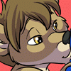
A second attempt at my new art style, and it was a request from  Bungle_Bear This was more difficult than my previous attempt, the linework was much more complex (although it doesn't seem like it) and I think the highlights didn't come out nearly as well, though Bungle Bear's face came out much better, so win some, loose some.
Very much not happy with Blue's tail, but hey, like I said, win some, loose some. Anyway, I learned some new stuff, so I hope I'll continue to make headway in this new art style.
PLEASE, if you like it, have comments, or have constructive criticism, post it! I want to hear what you have to say.
 Bungle_Bear This was more difficult than my previous attempt, the linework was much more complex (although it doesn't seem like it) and I think the highlights didn't come out nearly as well, though Bungle Bear's face came out much better, so win some, loose some.
 Very much not happy with
 Blue's tail, but hey, like I said, win some, loose some. Anyway, I learned some new stuff, so I hope I'll continue to make headway in this new art style.
 PLEASE, if you like it, have comments, or have constructive criticism, post it! I want to hear what you have to say.
Category Artwork (Digital) / Inflation
Species Unspecified / Any
Size 594 x 789px
File Size 284.6 kB
Well, to my eye, the highlights look pretty good. The glows aren't quite angled correctly in correlation with the shine marks, but the technique used in making them looks fine to me. As to the lines, they look all right as well; the colored lines accentuate the pastel tones elsewhere in the image, making it brighter. The shading in particular is nice and smooth without looking lumpy.
The only thing I'm leery of is your work with faces, but you seem to have made that criticism yourself. The eyes look flat, and parts of the face are angled oddly, the mouth and jaw in particular. The feet look a little funny compared with the hands, which are more distinct.
I could go on for a bit, but I think you get the idea.
Thanks for the input, I'll see what I can do to concentrate on those areas. I know that the highlights don't all go the same direction, it was an attempt to make the area look more rounded. For some reason I have yet to determine it worked better on the Tombfyre pic than it did in this one.
Oh well, back to the drawing board.
Oh well, back to the drawing board.
Love it! Thank you so much :) And very nice idea, too! :)
Blue's had a bit more stretching practice than me, need to fix that!!
Really like the direction you're going with your colouring and inking, I might have to dabble in some changes myself - it seems to add a refreshing difference to the final pieces! :)
Blue's had a bit more stretching practice than me, need to fix that!!
Really like the direction you're going with your colouring and inking, I might have to dabble in some changes myself - it seems to add a refreshing difference to the final pieces! :)

 FA+
FA+


Comments