 FA+
FA+
1855
Views
Views
152
Favorites
Favorites
Category
Artwork (Digital) / Macro / Micro
Species Avian (Other)
Size 885 x 872
File Size 819.8 kB
Report this content
More from BlackestManamultis


 [c]")


![resting on a concrete cushion [c]](http://d.furaffinity.net/art/blackestmanamultis/1694657361/1694657361.blackestmanamultis_full-sm.png "Click to change the View")

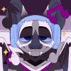
Commission for  Cyrus
Cyrus
Character: Phoebe
COMMISSION NOTES
This will be a weird note...
There's a suggestion by some that beauty should be pursued because you offer a better product. I think theat beauty should be pursued because it's beautiful. We carve a path to that shining place, that breathless golden extermination--that thresher. I throw myself into it, since I can't stand to be without it. I have it (Beauty, that is) slice away my eyes and bones and heart and all my senses until all I am is There, undeniably.
Another Phoebe!
 Cyrus
CyrusCharacter: Phoebe
COMMISSION NOTES
This will be a weird note...
There's a suggestion by some that beauty should be pursued because you offer a better product. I think theat beauty should be pursued because it's beautiful. We carve a path to that shining place, that breathless golden extermination--that thresher. I throw myself into it, since I can't stand to be without it. I have it (Beauty, that is) slice away my eyes and bones and heart and all my senses until all I am is There, undeniably.
Another Phoebe!
Category Artwork (Digital) / Macro / Micro
Species Avian (Other)
Size 885 x 872px
File Size 819.8 kB


Ah, thanks! Good to hear from you :D
In some ways I don't choose the palette. I usually generate color thumbnails and let the client choose. That would make the followup question, then, how did I decide to pursue the palettes here?
(Also, you should know that the two palettes I chose were this sunset-y one and a red and blue "Miami" one)
Welll....the background is that I'm always trying to find a "look" that I like. Heightened without feeling like I passed the thing through an Instagram filter. That and also somewhat grounded as well. I think the look may be the mimicry of 3D animated cartoons.
Anyway, each work is also a reaction to the previous work. This one came right after the poster for Kitsune G Project. In that drawing I noticed that the purple took on a kind of neutral color and I wanted to see if I could stop that from happening. I wanted to have colors that vibrated as much as possible without any neutral colors sucking up the energy. So I wanted colors that "vibrated with each other."
Additionally, I thought about the subject. Phoebe was red with blue eyes and so I wanted to try using a color palette that would harmonize with those. Sunset and Miami seemed to be a good fit. I also thought about the mood I was interested in creating. I generally prefer a warmer, brighter palette to a subdued one. I also think a lot about what might be a challenge to draw? Can I make a picture work using colors that I don't necessarily like?
So that's generally the kind of stuff I think about when choosing a palette. There's probably more to talk about even after that. Because color is perceived relative to other colors, choosing a color palette is not exactly the same thing as choosing the colors of the objects in the scene. If I use a lot of red--red highlights, reddish midtones, reddish shadows--you could say that I've created a red "environment." If I wanted to paint a color that looked green in a red environment, it might be best to go with something gray. In the red environment, the gray will appear to be green. Anyway, that's another topic...
Comments