 FA+
FA+
1107
Views
Views
172
Favorites
Favorites
Category
Artwork (Traditional) / All
Species Wolf
Size 674 x 900
File Size 890.6 kB
Report this content
More from blue-paper


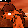
yeah I suck at titles.
But at least its not a song reference! :D
Something I've been working over like the past few weeks on and off. Mostly off. But I finished it!
Done traditionally with pen and ink, scanned and brought into illustrator to use livetrace on, then moved to photoshop to edit and clean up :V
But at least its not a song reference! :D
Something I've been working over like the past few weeks on and off. Mostly off. But I finished it!
Done traditionally with pen and ink, scanned and brought into illustrator to use livetrace on, then moved to photoshop to edit and clean up :V
Category Artwork (Traditional) / All
Species Wolf
Size 674 x 900px
File Size 890.6 kB


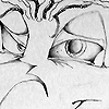


Technically, its supposed to be a Benelli M4 Super 90 (not sure if that's the same thing as what you're talking about given that it's also referred to as an M1014), as that is the model I use reference images for when drawing it :)
Whichhhh happens to be model that the auto shotgun in L4D 1 and 2 is based off of :B However I chose to use that model not just because it's probably my favorite weapon in the game, but more because I liked the idea and motion of pulling out the retractable stock lol
My entire knowledge of guns is almost entirely video game based, I know very little otherwise XD just letting you know


Great use of line to create the form of this! I like the viewpoint, dramatic lower view making the character seem almost heroic, i na sin city sort of way. I think you could push that perspective more using a variation with line weight. theres a good use of it in creating shading, but using more thick lines closer to the viewer and thinning them out as you push back in space will allow for that impact to come through. just a suggestion, I'd like to see some more art like this. Line is totally unappreciated in furry art.
yeah the perspective was actually a bit stronger in thumbnails and sketches I had done of it :/ it kind of got lost when I sketched it out for the final. I only really noticed after I had refined quite a bit of it and really didn't feel like starting a new one or going back and erasing because I take a long time when sketching things lol
I didn't want to focus too much on line weight, because a lo of it tends to get lost beneath the hatching and loss of detail in pieces like this is usually very significant and attempting to maintain it is difficult to do without drawing away from the integrity of the image ( I assume you mean line weight on the actual line art, rather than on the hatching, as using varied lineweight on hatching is difficult, tedious, and doesn't usually look all too great :B )
but thanks :)

Comments