 FA+
FA+
1771
Views
Views
128
Favorites
Favorites
Category
All / All
Species Unspecified / Any
Size 579 x 819
File Size 363.9 kB
Report this content
More from dreamer69


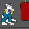
All done and colored now, I really wish I had put him in a different pose... gaaah I hate it XO, meh... whatever. To color this I used a totally different method then I usual would, normally I'd put down my flat tones, then throw in the shadow and light, however this time around I simply threw in the darkest tone as a base color and simply put the light in from there... seems to have worked, yay for me :P.
Anyways hope ya guys and gals like.
Edit: Man I can be a dumb @$$ sometimes... okay fine, most of the time. I was thinking about adding the ball of light last night while coloring it and wanted to add it once I was done/finished with shading the characters, but naturally when I awoke and finished it this morning, I totally forgot to add it T.T. sigh, anyways I'm a lot happier with the pic now, his pose make a hell of a lot more sense. Just wish I didn't have a memory like a sieve.... I blame TV :P lol
D.R
Category All / All
Species Unspecified / Any
Size 579 x 819px
File Size 363.9 kB


Ok so the pose was a bt weak, but you still accomplished the goal.
You did the Darkness and made it The Darkness!
The pose was one thing but everything else matches up to where it would be!
EXCEPT if you want to get puritan about it like I know I would! XD
The background: solid black
shaded areas: solid black
inside of mouths: solid black
and probably another layer of dark on top of it to add a bit more depth to the details.
Right now it looks like they're sitting under a single flickering halogen bulb. So it's appropriate, it's dark, but maybe not dark enough.
There, does that make you feel any better? Ya still did a complete piece with a good result. I hope you're at least happy about that.
LOL actually it made me feel worse :P but eh that's just me, I hate to be corrected.
Gotta say though uh.. it's really really dark as is I'd never make it any darker, that would be going overboard I mean I've got a few issues and there isn't a single image of him that's this dark... unless the artist made large areas of pure black with ink. Thanks for the uh.. response though :)
Gotta say though uh.. it's really really dark as is I'd never make it any darker, that would be going overboard I mean I've got a few issues and there isn't a single image of him that's this dark... unless the artist made large areas of pure black with ink. Thanks for the uh.. response though :)
Dammit, wasn't trying to make you feel worse. Was trying to give some honest no BS "here's what I think and why" constructive criticism.
Usually I'm happy as hell when someone says more than "Hey that's COOL!"
My bad TT_TT
as for dark, maybe that's the difference between our monitor brightness or something, cuz I have a bunch of Darkness commics here and by comparison yeah this pic is pretty ... luminous ... hmmm ... by comparison. Mind you there are plenty out there that aren't dark AT ALL! So it's fine.
Just, if it had been me I would have hosed it with black! XD but it's not my piece of coarse.
Meh.. no worries, you don't know me from a bar of soap and so wouldn't know how I'd respond to such comments :P I'm just a little hermit who probably doesn't know any better lol
And ya know I was thinking the same thing about the monitors.. just didn't say it as I thought I'd be going too far. So yeah don't worry.. later I'm sure I'll be happy ya said what ya did ;)
And ya know I was thinking the same thing about the monitors.. just didn't say it as I thought I'd be going too far. So yeah don't worry.. later I'm sure I'll be happy ya said what ya did ;)

hrm... after looking over the piece, and considering the pallette of colors used, Solid black would have been too dark, not fitting in with the rest of the tones, and would stand out... prolly driving him to change the tones and throw off the overall color job. I have fallen into that trap when drawing darkness/witchblade art... i obsess about making it dark and end up losing detail. I think there is a good balance here, and the piece is well executed. a purist would also make his outfit a deeper or brighter green, which actually isn't that realistic in the darker settings he is always in... here his overall color is subdued, which is more consistent. good job!


LOL No no. I was referring to the Rick James episode on the Chapelle show.
See for yourself and laugh out loud. ^^
http://youtube.com/watch?v=KOZ-kS1cJUA
See for yourself and laugh out loud. ^^
http://youtube.com/watch?v=KOZ-kS1cJUA


Comments