 FA+
FA+
314
Views
Views
11
Favorites
Favorites
Category
Artwork (Digital) / Comics
Species Unspecified / Any
Size 500 x 625
File Size 165.7 kB
Report this content
More from refleximage


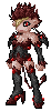
Any comments about how to improve the layout/design would be greatly appreciated!
Was thinking it would work something like battlechasers #9 cover http://www.popimage.com/upfront/pre.....tlechasers.jpg
Was thinking it would work something like battlechasers #9 cover http://www.popimage.com/upfront/pre.....tlechasers.jpg
Category Artwork (Digital) / Comics
Species Unspecified / Any
Size 500 x 625px
File Size 165.7 kB


You have to remember where the title will go, the price box and UPC code box will also be on there. Take those into consideration when you lay out a cover.
Depending on title placement I could see either the characters in the upper right or the girl in the upper left getting covered with Title block.
Depending on title placement I could see either the characters in the upper right or the girl in the upper left getting covered with Title block.

Personally, taking DustyKat's suggestions into play as well, I'de suggest removing the furtherst top right pic, move the middle one in the cloak down and to the left, almost centering it, and then move the profile shot down, clearing some spots for thoes barcodes and such. But overall, it looks great =D Always keeps the eye moving =)
~N~
~N~
It's supposed to be one of those, here are a bunch of main characters in a busy picture where none of them are together, but they're all together. I'm sure there's a word for that type of layout, I just don't know it. There is going to be some room, but I don't know if it's really smart to leave space between the characters, because I don't know what kind of background to put in there.
It's called an establishing, or splash page. If you are going to put this many characters on it, you dont need a background. Infact it would be detrimental to the piece and make it hard to "read" If you were going with this layout I would make the background a solid color, the characters over that color and the snazzy logo on top of that.
Comments