 FA+
FA+
467
Views
Views
21
Favorites
Favorites
Category
Artwork (Digital) / Human
Species Cervine (Other)
Size 1000 x 1000
File Size 666.4 kB
Report this content
More from KobRaa


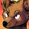
A first attempt at a human face for the deer girl design I submitted a while ago - part of an ongoing commission.
Again, my experimental side shows - this was created using a lot less layers than usual (visible, at least): one for gray background, one for facial form and shading, one for hair form and shading, one for lighting, and one for color overlay.
I used pretty much only one brush - a custom brush made in SAI meant to replicate the stroke of a hard circular brush, which had pressure sensitivity assigned only to transparency. I called it the "sculpt" brush :P
Photo reference used, though no tracing was made.
Category Artwork (Digital) / Human
Species Cervine (Other)
Size 1000 x 1000px
File Size 666.4 kB

Since this was an experiment on an eyeballing point of view as well as a rendering one, and I've been looking and sculpting at this for the past few hours instead of sleeping, I can imagine some unwanted features or aspects might have slipped by. This is by no means the final design :)

I think he's talking about this guy: http://media.ebaumsworld.com/pictur.....Hasselhoff.png

Nice experiment here! I'm impressed. The colouring on the lips is really pretty, as is the left eye. Your highlights are very nicely done but the shading seems a little desaturated by comparison and I cant help but think a small touch of pinkish tone would give the skin a bit more life. If that was intentional then disregard my critique.
Thanks for the kind words, and the critique :)
Regarding the coloring - at first I thought about posting the drawing in gray-scale, since that's the part I spent the most time on. The colors were pretty much a last-minute overlay before going to bed (which was at about 6:30 in the AM), so I didn't concentrate on saturation and color temperatures much. In short: not intentional, just rushed
Regarding the coloring - at first I thought about posting the drawing in gray-scale, since that's the part I spent the most time on. The colors were pretty much a last-minute overlay before going to bed (which was at about 6:30 in the AM), so I didn't concentrate on saturation and color temperatures much. In short: not intentional, just rushed
Ahh I see. I don't work much in greyscale myself as I prefer to mix my colours rather than just using a darker version of the same colour. Upping the opacity of your colour overlay definitely makes it pop a little more imo :) Hope to see more experimental pieces like this from you, it's lovely.


Comments