 FA+
FA+
890
Views
Views
51
Favorites
Favorites
Category
Artwork (Traditional) / Fat Furs
Species Bear (Other)
Size 851 x 1107
File Size 1.69 MB
Report this content
More from BalooBear


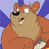
Traditional Prismacolor Pencil on Bristol enhanced and filtered by Adobe Photo Shop.
I came across this artist and fell in love with this illustration. http://davidsdoodles.deviantart.com.....lery/#/d2n67mh
I had to Redraw a similar character with my style based off Davids Bear Gary
Big Belly And Big Cute Butt How Could You Resist *Wiggles Tail*
Prints available message me if your interested
Thanks
Category Artwork (Traditional) / Fat Furs
Species Bear (Other)
Size 851 x 1107px
File Size 1.69 MB


nice pic :o) I like that you did it the old fashion way and not all computer generated. I like to draw on paper myself too, I do a pencil sketch and then ink over and color on the computer most of the time because it's faster but I prefer to color with pencils too.
I love the pose and the big rump, the shading is really nice good job with the pencils, the line work is great too with nice shaggy fur, front paws look a little skinny but that might be just me that thinks that cause I like paws :o) I like the expression on his face, very happy and I like that he looks like a bear, personally like bears to look like bears not humans which your does. Awesome work Baloo
Have a good holiday
Fuzzy

Well hey there! :)
Lookin good so far! :) I think you really did a good job capturing the bear's weight with his general form and thick heavy body and body folds. :) the paws look nice too, as well as the toony happy face. :)
If I were to make one piece of constructive criticism, is actually a small one: You have this nice earthy sienna brown-ish color going for the bear... and that really flat saturated RED for the tongue, sticks out like a sore thumb to me. :) So I'd say to just try and keep in mind the harmony of your colors. View your artwork from different angles and in the mirror and stuff to see it in a different perspective to see what you can work on (this goes for colors, forms, composition, balance, etc.) So for the tongue specifically, I'd use a more "earthy" red".
Also, as a side note, it's a bit of a pet peeve of mine, I think it's totally important for artists to sign their work, but just my opinion, I PERSONALLY find giant watermarks to be overly distracting from the artwork, and are more obnoxious rather than helpful. The way I look at it, is if someone wanted to steal artwork, it's easy enough with Photoshop to get rid of most signatures anyway, so why not just let the art speak for itself and not worry about thieves?
Just my two cents. :)
Keep up the good work!
Thanks Buddy I really appreciate your input *hugs* and your right about the tongue I now notice what you mean :) Watermarks I do agree with you. But just spent alot of time for some one to steal it iv seen people take credit for others works Pisses me off so much. I figure is some one wants to see it with out a watermark badly enough they could buy a print
I know what you mean about people stealing art, I have seen plenty of my art and photos on other peoples sites trying to make money off them, what I do is post low res version under 500x500 pixels that way it's not something that they can really print. I send hi res versions only to the people who I do the pics for or to friends.
I always forget to sign my work too :o)
I always forget to sign my work too :o)


Awwww, very cute!
Not sure what I would suggest here ... if you're looking for specific things to work on, I'd suggest trying to research a bit into how you draw the structure of the character ... the underlying masses of the body, and the face/head. But really, this drawing isn't bad at all!
(Sorry it took me forever to reply, been busy here ...)
I've found that the more you learn to draw (honestly and diligently), the more it helps ALL your drawing ... A few weeks of intensive life drawing would always end up making my cartoony drawings look even better. :) Good luck!
It's the underlying drawing, pose, attitude that shines with life ... a realistic or cartoony finish is just the icing on the cake!
It's the underlying drawing, pose, attitude that shines with life ... a realistic or cartoony finish is just the icing on the cake!


Comments