 FA+
FA+
1565
Views
Views
99
Favorites
Favorites
Category
Artwork (Digital) / All
Species Dragon (Other)
Size 1280 x 1205
File Size 214.4 kB
Report this content
More from blkdragon
")


I'm doing a bit of an art dump to clear out doodles, unfinished work, and general cruft sitting in my art folders over the year in an attempt to get focus back on the few things I need to get done (finishing and inking a few comics). These are all pieces I had just laying around or planned on being something bigger, but I am posting to give some finality to them rather than try to add more work to my current project list.
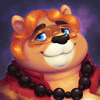
This one was just a fun piece to play around with a different style, making BLK and Alan a little more tooney. I also tried a few changes to the character designs; I do these doodles every so often but I don't usually post them. This time I thought it would fun to post it out and get people's opinions.
I don't expect anything to come from this, but a few things to note. I kind of like BLK with a little bit of an underbite. I don't think I like the big chin, but I might play around with underbite as it looks a little more powerful in an innocent way. I know one of my friend is very opinionated at this, and I eagerly await the dissertation on why this would be a bad decision. The other one is little wings on BLK. I've been debating them since I initially made BLK. It would be one way to differentiate BLK as a dragon from Alan as a kobold, but it complicates some story ideas I've thought about for the two of them. Third, I brightened up BLK and made his hide a bit warmer.
Question time! Is there anything about this design you like or dislike from this little experiment?
Category Artwork (Digital) / All
Species Dragon (Other)
Size 1280 x 1205px
File Size 214.4 kB


Hmmm an underbite could work for BLK, and/or snaggly crooked teeth. (shoulda kept up with your dental plan?...naaaah). I disagree with wings. Dragonhead will tell yoou that not all dragons have wings or have the ability to fly.
Orange brown? sure why not? Orange your hero color.
Also there are such things as winged kobolds, so wings don't distinguish between dragon and kobl. Alan looks like a kid here.
Things to think about. I'm mostly neutral here. -3-
Orange brown? sure why not? Orange your hero color.
Also there are such things as winged kobolds, so wings don't distinguish between dragon and kobl. Alan looks like a kid here.
Things to think about. I'm mostly neutral here. -3-


Aaahh I admittedly don't care for the big underbite/chin displayed here, but an underbite in general might work? The arm and legs and bigger jaw speak more 'dinosaur' to me than dragon, with the floofy feather wings kinda feeling more tacked-on. And I do prefer Alan's usual proportions, though I'll admit having the 'ear-fins' be solid orange as opposed to having the red 'spines/fingers' to work fine and would make drawing them lots easier!
I do approve of the changes to BLK's hide being more orange too!
I will admit in spite of my bias I recognize this more toon-ish take on them has better silhouetting/shapes to make them more recognizable, but I prefer your usual methods because they have more 'believable weight' to em.
I do approve of the changes to BLK's hide being more orange too!
I will admit in spite of my bias I recognize this more toon-ish take on them has better silhouetting/shapes to make them more recognizable, but I prefer your usual methods because they have more 'believable weight' to em.

Comments