 FA+
FA+
1769
Views
Views
14
Favorites
Favorites
Category
All / All
Species Unspecified / Any
Size 800 x 639
File Size 87.4 kB
Report this content
★
More from Kacey


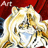
Here is where I am right now... and I decided to stop here and post my progress before I continue tomorrow...
When painting, I find it is a good idea to paint the most distant things first. That way, you dont have to do repainting around edges (say if I painstakingly painted the characters the way I liked them, and then had to dodge around them to paint the background. This way I can paint into the characters a little here and there and not sweat over it as I will be painting over them completely.
That, and the background sets the colors and lighting scheme that the characters reside in. Where they are lit from, what colors should be reflecting from their clothing/fur, etc, so they look more at home in their environment, rather than 'pasted in'.
Okay - so like I said earlier in this WIP, the idea of blurring a background to have it out of focus and receding into the background is a new concept for me, I've only attempted it once or twice before, and neither time was it with an interior setting with any architecture. I couldn't find any bar scenes that really appealed to me on Google, so I came up with this layout from scratch. I just thought of the idea of wooden counters, carpeted floors with a few stairs, and some hanging televisions providing some blue light, and some other incandescent lights creating some yellow light. Figures added in the background to make the scene seem populated, and though not extremely lively, at least comfortable and not desolate.
The paints I used are all Golden fluid acrylics - with a little Satin finish acrylic glazing liquid that I use as a retardant - and I also use water to further thin the mixture, creating a watercolor-like consistency. I started by painting in light watercolorish washes of my desired colors in the areas I'd blocked out in my sketch... and slowly layered and darkened each shape, also adding a 'halo' or a thinned out version of that color around the shape to blur it into the next shape. The further back into the piece, the more blurred the shapes, and the more rounded the blurs are. Nearer to the characters, the lines are merely softened.
But I kindof just built the background as I went, adjusting things as I went, by layering.
To get a good blur in some places, I put a little paint on my brush, and then dried the brush on a piece of paper towel, and then applied the dry paint to the area to get a subtle mark. Sometimes I used my fingertips to smudge applied paint... I don't really know what I'm doing, but I know how I want it to look, and I keep working it until I get there. And then I try to remember how I got there. Thats a big part of the fun of it for me, is that its not just practiced technique, its playing, and experimentation.
I think I use a different technique for each painting I do.
I'm not sure what the next step here is going to be. I'm either going to paint the pool table next, or the characters. Typically I leave the characters for last, so that I get the reflected colors proper, so that is probably what I will do.
Also I should note that from the very first sketch I had my signature location blocked in. Thats become pretty important to me. I remember back when I wrote longhand signatures, and I added them at the end, after I'd worked hours on a piece, and I wanted to hide them, because I felt like I was damaging the work I'd just done, by scribbling my name on it. My block signature not only looks more artistic (in my opinion) than the longhand version, but I can work it into a drawing from the beginning, and not worry about it messing up my composition at the end.
Okay, more to come later, as I will have to paint it first =D. I hope this is enjoyable
Category All / All
Species Unspecified / Any
Size 800 x 639px
File Size 87.4 kB


Wow, you work -completely- differently from I do, I have to fill in huge swatches of color all at once and work the whole picture the entire time or else I think it just looks weird.... The white would be so distracting to me. I don't know how you do it!
Nice job so far though, the feel of the background is very nice, though the fox worries me a little; his eyes are sunken so deep into his head that he's looking kind of, well, dead...
Nice job so far though, the feel of the background is very nice, though the fox worries me a little; his eyes are sunken so deep into his head that he's looking kind of, well, dead...
Heh - you're right. I'll go back in and rework them.
It was funny - while I was working on that part, I added a reflection off the eyes from within the sunken areas, and he looked positively demonic, so I darkened it again LOL. But if I define lids and shadowed but distinct eyes he probably wont look so creepy.
It was funny - while I was working on that part, I added a reflection off the eyes from within the sunken areas, and he looked positively demonic, so I darkened it again LOL. But if I define lids and shadowed but distinct eyes he probably wont look so creepy.
oh - and yeah - my teachers tried to get me to paint the whole canvas first, and then work it up from there. I have done that sometimes, but I have no problems ignoring the white space and find it easier to work on small parts at a time. That way I also dont have to decide all the colors right from the start - I can decide like, for the females dress, what color it will be based on the other colors I've chosen for the rest, and what would fit best based on what is already there.
I can definitely see the benefits to both techniques, though =).
I can definitely see the benefits to both techniques, though =).

Oh man, thank you *so much* for posting this. Seeing how you work is an incredible help to me, as I really have no freaking clue what I'm doing with acrylics every single time I pick them up.
I do really love the medium a hell of a lot, and I'm kind of happy I didn't sink a ton of money into goauche. It's nice, but acrylic is just that much more flexible.
I totally hear you about experimenting when you do a piece. If you aren't trying to refine your technique and focus on expanding your boundaries as an artist, you're kinda saying that you've lost your spark for it. At least, that's what I think.
Thanks a ton for posting these with such an indepth commentary.
No problem =D! I am happy it is helpful.
Acrylics rule. I used to hate them with a passion... but I was used to working with oils (which are heaven, but they are impractical for my uses now as they take months to fully dry) and acrylics just dried to darn fast. I was using liquitex tube acrylics with no retardant though, and it was really awkward and difficult for me.
One of these days I will try gouache...
And yeah - if I did the same thing over and over again, it would be no fun anymore. And it would show.
*laughs* Acrylics steamrollered goauche so hard for me. That being said, I can't imagine myself even touching oils ever again. I did them back in highschool enough to get a feel for them, and I hated them.
The fact that acrylic has the infinite flexibility of mediums is what makes them as amazing as they are. They can somewhat emulate any other medium, provided you know what to do. And I can see the potential they have in multimedia work.
You can do some beautiful work in them (Alex Ross, anyone?), but they have some unusual working properties. They color shift in odd ways (lights get darker and darks get lighter as they dry) and there is this period in working with them where you can't touch them or it makes all this awful texture on the normally flat velvety matt finish these paints have.


Comments