 FA+
FA+
1236
Views
Views
58
Favorites
Favorites
Category
All / All
Species Bear (Other)
Size 749 x 1280
File Size 129 kB
Report this content
★
More from BruBearBrown
")


 MuscleWolf, The Father Of Muscle Furs.")


....Meus mens votum lux lucis pro diutius......
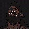
HAppy Hallow.................. Aw damn....... way over due then............
Bah....... anyways......... this took me..... god knows how long to do. What with trying to sort out my tablet annnnnnd..... messing up with my layers and having to multiply them all.... urgh..... anyways......
Uhm........... I really hope this turned out okay......... Please tell me what you think......
Category All / All
Species Bear (Other)
Size 749 x 1280px
File Size 129 kB


Just keep the words "constructive critism" in mind the whole time
Of course. I'm not THAT much of a meanie...
Having been able to see how you work on your stream session, you pay so much attention to having your lines look "just right", but I think the bigger problem is the anatomy itself. Especially on the figure on the foreground. I can't tell which way he is turning. His legs look like a front-view, his torso looks like a side-view, and everything above the chest looks like a mix between a front view and a side view. I can't figure out how his legs are turned. It all looks disjointed.
The details you put into the line work get obscured by your colors. Some of them look rendered, some of them look flat, and the lines are too thin to really separate things that are that different from each other. They tend to bleed together and form a lot of confusion about what is where.
When you add highlights and shadows to objects, it's important to remember that objects closer to a light source will have sharper edges to their highlights and shadows. When everything becomes blurred like that, it looks like a soupy mishmosh of color without any solid changes in value - which just makes everything looks confused. It would have also helped if you carried the highlights throughout both figures, not just the shoulders on the guy behind.
If there's anything you didn't get, please let me know and I'll be happy to explain further. I hope I've been able to help.
He was meant to be walking forward....... Like......... one foot in front of the other, taking a step towards the screen, his body swaying while he's possesed.
And my linework? I'm afraid thats just how I draw, and thats not going to change anytime soon, I like putting in detail. I pay a lot of attention to anatomy actually. I based this figure on a real life one, so it was me just messing up with the anatomy of making him bigger.
The reason a lot of the colours messed up on this one was because I...... messed up....... I done the lines, then saved the image as a jpeg and forgot to save the project.... So I had to multiply ALL the colours onto all different layers to actually finish this picture. This took me about 3 days to finish. It got to a point that I just went "fuck it...... I can't be bothered any more" and just left it.
I worry constantly about my colours being too garish.......... I don't...... seem to have a definitive colouring style....... or one at all for that matter......... So.......... What would you suggest? Darker shadows that are cel shaded more than anything?
And........ There ARE highlights on the character in the foreground...... on his forehead, his shoulders and his chest, they're all there but a bit more faded than the figure in the background. So...... they're there......... just not as defined, as you said.
I never said detail was a bad thing, just that your way of coloring obscures a lot of the detail.
It got to a point that I just went "fuck it...... I can't be bothered any more" and just left it.
I can tell. Sometimes it just takes a little while away from a picture before you can come back to it and solve the issues.
So.......... What would you suggest? Darker shadows that are cel shaded more than anything?
Try different things. Experiment. Find artists you like, see how they go about solving problems and try adopting their methods to your work to see if they fit.


He was meant to be walking forward....... Like......... one foot in front of the other, taking a step towards the screen, his body swaying while he's possesed.
And the reason he looks so scrunched is because I wanted to try and give him the whole "short body, but packed with muscle/fat" look, obviously failed :P
And the reason he looks so scrunched is because I wanted to try and give him the whole "short body, but packed with muscle/fat" look, obviously failed :P
I think it has to do with how unique your character's anatomy is, honestly if he had less of a neck he probably be facing alil more to our right, but you can see that from the belly swaying to the right....hm, also probably doesnt help that your legs are so thick XD One's basically covering the other, so maybe a wide stance? *shrug* I think it looks fine, but on the other hand it's probably one of those things you dont know what going on till you know what youre looking at.
*chuckles* Good lord, THANK YOU! There is a god.........
And yeah..... I think I may have tried to go for a pose I'm actually not capable of pulling off, heh. But...... then again you don't often see a character of Brus size doing something like this...... usually they're just standing there and posing y'know? I didn't wanna fall into that predictablilty...... But it seems I messed up heh........ I'll just have to make up for it in my next picture x3
And yeah..... I think I may have tried to go for a pose I'm actually not capable of pulling off, heh. But...... then again you don't often see a character of Brus size doing something like this...... usually they're just standing there and posing y'know? I didn't wanna fall into that predictablilty...... But it seems I messed up heh........ I'll just have to make up for it in my next picture x3
I've Got Two things here one is he a werebear......and two i think his drunk......*Chuckles*
Just Kidding Just Kidding...I like the background and the bear cause for it's unique possibilities of getting possessed or manipulated...Still you draw Really Great than mine is just all copy from copy...but i don't post it as mine i just post it for artistic relations......nice Coloring and All Your Drawings Are Really Cool......Love
Just Kidding Just Kidding...I like the background and the bear cause for it's unique possibilities of getting possessed or manipulated...Still you draw Really Great than mine is just all copy from copy...but i don't post it as mine i just post it for artistic relations......nice Coloring and All Your Drawings Are Really Cool......Love


Where does this Latin come from? It looks machine-translated, though that doesn't quite explain why "light" gets translated each time as "lux lucis" (literally "light of light", but more reminiscent of what you'd see in a dictionary headword—like seeing 'eat, ate, eaten' together).
*laughs* I don't know a word of latin to be honest. I really did just put it into a latin translator and took it off of there. I think "Fingers" is in there too because it didn't know any other word for it........ I tried "digits" and all that kinda stuff but it just didn't work, heh.
Comments