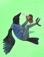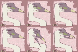
I guess the final version is due for print soon, so now I'm frantically finishing things up. uuug.
Anyhow, can you see anything particularly wrong in this? Anything that doesn't read well?? Are my birds too ambiguous? is the text placed alright? Is the valley detailed enough? too detailed?
leetttt me knooooowwww!!
Anyhow, can you see anything particularly wrong in this? Anything that doesn't read well?? Are my birds too ambiguous? is the text placed alright? Is the valley detailed enough? too detailed?
leetttt me knooooowwww!!
Category All / All
Species Unspecified / Any
Size 1150 x 850px
File Size 503.9 kB
It looks great, I think.
Only things I can point is the area on the front cover around the bird flying... it's the sea-green color area. The lack of detail does show depth... but I think that where its closer to the right side it could use some detail. Essepecially considering the ground and the stream, which are highly detailed, I'm wondering why something closer than that area is less in focus than what is farther from it. I mean, that's even nit-picking, I think it's excusable. I do think though, that continuing that green pattern down a bit and fading it out more would be better.
I also am not sure about the font color on the spine. Maybe if it was darker, and had a little more red in it. Like a dark burnt sienna color. Or perhaps you could put a small border around it? I also am partial to the font itself... although with something like text on the spine of a book you want to go for maxium readability, and if that's what gets you it then stick with it. It's just kind of bland compared to the fanciful text in the front.
AAAaand thats my honest art-fag opinion!

 FA+
FA+


Comments