 FA+
FA+
290
Views
Views
0
Favorites
Favorites
Category
Artwork (Digital) / General Furry Art
Species Mouse
Size 1254 x 1280
File Size 199.7 kB
Report this content
More from HelpToImprove


Username:  Fox-Phantom
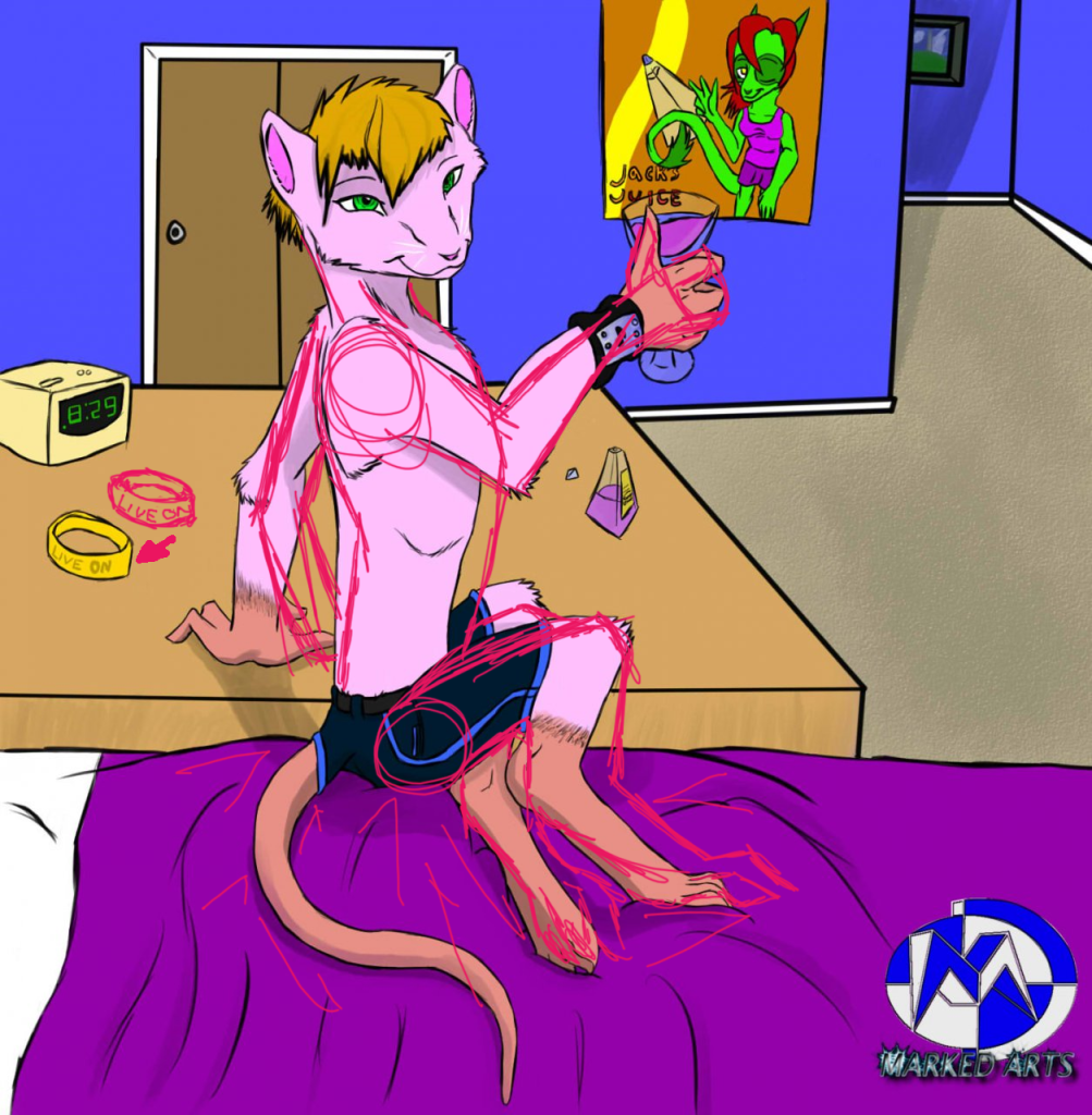
Submission Name: Misu
Larger/Original Version: http://www.furaffinity.net/view/4687040
Species: Dreamkeeper, Mouse
Type of Media:] Digital Art
Type of Response wanted: Constructive criticism, redlines, tips, comments... anything.
Artist's Comments: Misu was done in another style, but was drawn by me.
Misu is my Dreamsona. (dreamkeeper/Fursona), I made the character since I wanted to make something that is related to the theme. and to also express one part of myself.
Dreamkeepers was made by David Lillie, for more info: http://www.dreamkeeperscomic.com/
Art © Fox-Phantom
All comments/help/criticism/redlines are appreciated!
 Fox-Phantom
Submission Name: Misu
Larger/Original Version: http://www.furaffinity.net/view/4687040
Species: Dreamkeeper, Mouse
Type of Media:] Digital Art
Type of Response wanted: Constructive criticism, redlines, tips, comments... anything.
Artist's Comments: Misu was done in another style, but was drawn by me.
Misu is my Dreamsona. (dreamkeeper/Fursona), I made the character since I wanted to make something that is related to the theme. and to also express one part of myself.
Dreamkeepers was made by David Lillie, for more info: http://www.dreamkeeperscomic.com/
Art ©
Fox-PhantomAll comments/help/criticism/redlines are appreciated!
Category Artwork (Digital) / General Furry Art
Species Mouse
Size 1254 x 1280px
File Size 199.7 kB
Hm. I'm negative about everything, so I'll tell you what's wrong
1) The bottle. Basically said bottle is a pyramid with tip sawed off.
The square left from the "sawed-off" tip should have the same proportions - that is, line ratio, not exactly the same edge length - as the pyramid's base. Would look quite...awkward else.
2) The wristband. It's basically a cylinder with a cylindrical piece removed inside. That is: All elliptic shapes with the same diameter should be parallel.
The bottle is basically, pyramid shaped. The top of it is the lid for it. XD
I don't always draw bottles like this. (this was a once in a while thing I like doing.)
Over all yes, I agree with you that the wrist band should have been cylinder, but I went for a look that made it looked stuffed on the inside. Anyways I'll keep in mind about the wrist bands next time I do another.

Hey there! I think this is really cute and I adore the colors you used!
However I think the body might be shaped a bit wrong. It looks like it's slowly getting smaller down to the feet, and while the torso is very long, the legs, rump, and feet are very short, so you might want to work just a bit on proportions. Holding the glass, I would probably have either moved the thumb over, or had it wrapped around the glass. Also thumbs are curved so try to work on that a bit, instead of having it straight up and down. Look at how your thumb is shaped and go from there! But overall on the hands you did pretty well. It's one of my biggest banes, I have to say lol!
The table is huge compared with the bed! I dont know if you meant it to be that big or not, but once again I'd take a look at proportions!
It's really cute though! I think it's obvious you spent a lot of time on this!

the legs structure is a bit off. though you seemed to be going for
more anthro digigrade legs, they are a bit too small for the body given. Also structure of perportions are off a touch, the head is too big, legs too small. I see alot of artists start with a good size head and shoulders and somehow slowly let everything shrink down as they draw down the body. Layout lines and structure bases are important for this issue.
Facial structure is off a bit too, the main issue with this is the eye on the right. The hand presenting the glass is nicely done,
too bad the forearm is bent.
That's one of things I have troubles with, keeping things in proportions. I do try, but I don't see it as everyone else would. : / (it's weird how I can draw a human with almost the right anatomy on paper, but can't draw the right size on the computer.)
I also have trouble keeping both eyes in the right length. I'll try and keep it in mind.
I also have trouble keeping both eyes in the right length. I'll try and keep it in mind.
I have no idea about gimp
But on sai, that first toolbar underneath "File, edit" etc, at the very end you'll see your stabalizer (mine's set to 5) just before that you'll see a button with an arrow going one way, and an arrow going the opposite way underneath the first arrow.. That button is your invert button. CLick it once to turn your pic around, click it again to turn it back.
But on sai, that first toolbar underneath "File, edit" etc, at the very end you'll see your stabalizer (mine's set to 5) just before that you'll see a button with an arrow going one way, and an arrow going the opposite way underneath the first arrow.. That button is your invert button. CLick it once to turn your pic around, click it again to turn it back.

Digitaly Colored or Digitaly Drawn?
The line work in some areas are a bit rough which makes it apear a bit more traditional.
There isn't much wrong with the picture in general. Over all its quite decent.
The only thing I would like to point out is the proportions on the lower body of the main character. It has an apperence of a smaller body and doesnt' look quite right.
Again overall its pretty decent so nice work.

I see anatomy and background are pretty well explained by others, so I´ll put my focus on color.
Based on the style you wanted to do, I think you should lower your pallette a little, as well as to pick more desaturated colors for the background (I learnt this from PurpleKecleon , she did an awesome color tutorial, you should check it out). You could use a little bit more shading on the character, otherwise he looks a little flat to me...
Look http://img181.imageshack.us/img181/.....ptoimprove.jpg , I did a bit of a redline and re-drew the shadows on top of your drawing, I think these shadows fit more the light source from his arm...
Remember objects do have shadows, and that things project shadows on others...
I also used gray gradients to give it more depth, it´s just a suggestion, as everything else.
I lowered your pallete by doing those gradients.
I hope this helps you ^^
Based on the style you wanted to do, I think you should lower your pallette a little, as well as to pick more desaturated colors for the background (I learnt this from
 PurpleKecleon , she did an awesome color tutorial, you should check it out). You could use a little bit more shading on the character, otherwise he looks a little flat to me...
 Look http://img181.imageshack.us/img181/.....ptoimprove.jpg , I did a bit of a redline and re-drew the shadows on top of your drawing, I think these shadows fit more the light source from his arm...
Remember objects do have shadows, and that things project shadows on others...
I also used gray gradients to give it more depth, it´s just a suggestion, as everything else.
I lowered your pallete by doing those gradients.
I hope this helps you ^^

Again, you have an amazing ability to work on background and really paint a scene stuck in time. =) I really believe this is happening, and it's very pleasing to both the eyes, and my brain. Since my brain is trying to work out a scenario for him. =) Great job!
The only huge thing I have a problem with, is his torso. It's really too thin, and he's sitting too stiffly, like a cartoon character. You should slope his back a bit more, and give his a good chest and belly to go with it. Also, the arms are really wonky, the one in the background is way too far back and bent weird, the one in the front just is unproportional. I hope this redline helps: http://i303.photobucket.com/albums/.....antom-Misu.png
The only huge thing I have a problem with, is his torso. It's really too thin, and he's sitting too stiffly, like a cartoon character. You should slope his back a bit more, and give his a good chest and belly to go with it. Also, the arms are really wonky, the one in the background is way too far back and bent weird, the one in the front just is unproportional. I hope this redline helps: http://i303.photobucket.com/albums/.....antom-Misu.png
Comments