 FA+
FA+
332
Views
Views
4
Favorites
Favorites
Category
All / All
Species Unspecified / Any
Size 805 x 595
File Size 277.9 kB
Report this content
More from arpad


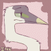
OK so here's my current sketch of the Lit. Magazine cover.
The bird and title are esecially rough (just added them tonight and their colors are not at all final), but everything else I've been chipping away at for a while.
The theme of this book has turned out to be birds dropping seeds and plants growing. heres what the inside pages will kind of look like (not that you can tell):
http://www.youtube.com/watch?v=mJnmnMWSFrg&feature=youtube_gdata
do you have any suggestions/critiques? I want this cover to be the best it can be, and I have until Nov. 24th to do so, so I'm all for making improvements upon this.
Category All / All
Species Unspecified / Any
Size 805 x 595px
File Size 277.9 kB

Very well thought out colour scheme, and the piece works very well compositionally since the bird is placed to be a focal point within it's half of the image and within the image as a whole. I'm really not liking the letters though. The color doesn't fit well (though you said that will probably change) and I don't like the placement very much either. Why run off the top of the page and it makes them a little difficult to read.
Seconding, I'm not liking the fonting either. It looks like an afterthought that was hurried up and crushed in the spot. Maybe you could design the letters like plants along the bottom of that side of the page? It'd go with the theme pretty well I think.
Otherwise though, this is GORGEOUS. Something I'd totally hang on my wall! And I love the page flip idea too, that's really really cool. :)
Otherwise though, this is GORGEOUS. Something I'd totally hang on my wall! And I love the page flip idea too, that's really really cool. :)
Ooh good idea with the plant letters, I'll have to try that. The letters on there were an afterthought, really. The last time I presented this to the class they were confused because they couldn't visualize it as a cover without lettering, so I figured I'd throw something on there.
Thanks!
Thanks!
Comments