 FA+
FA+
262
Views
Views
0
Favorites
Favorites
Category
Artwork (Digital) / All
Species Mammal (Other)
Size 800 x 965
File Size 200.5 kB
Report this content
More from HelpToImprove


Username:  vamplust
Larger/Original Version: http://www.furaffinity.net/view/4642203/
Species: None
Gender: Male
Type of Media: Digitalart
Type of Response wanted: Constructive Criticism, Feedback, Ideas, Advice
Artist's Comments:
This is just a quick experiment I did, working with shading techniques and I would like to know anything I can do to improve on this. I would also like some tips, if any, from artists who use photoshop on how to shade to bring out the texture of fur and not just put in plain flat colors.
Art © vamplust
All comments/help/criticism/redlines are appreciated!
 vamplust
Larger/Original Version: http://www.furaffinity.net/view/4642203/
Species: None
Gender: Male
Type of Media: Digitalart
Type of Response wanted: Constructive Criticism, Feedback, Ideas, Advice
Artist's Comments:
This is just a quick experiment I did, working with shading techniques and I would like to know anything I can do to improve on this. I would also like some tips, if any, from artists who use photoshop on how to shade to bring out the texture of fur and not just put in plain flat colors.
Art ©
vamplustAll comments/help/criticism/redlines are appreciated!
Category Artwork (Digital) / All
Species Mammal (Other)
Size 800 x 965px
File Size 200.5 kB

Nice work!
Id just comment a bit on the lights, you certainly placed one main light correctly, it would be interesting to see the shadows that are caused by more than one light, perhaps one main on the right up corner and a 50% one on the other side…
As for what you did, I like it overall, except that some lights make no sense, for example, on the left arm (the one on the back) there is a light in an area where light wouldn't hit unless the arm is somehow raised, and the light on the head seems a tad linear, where it should follow the shape of the head, just like the shadow does.
Good proportions overall, tho I think the elbows are a tad higher than they should and the top part of the head could use some volume so it doesn't look to anime like, specially when the rest of the body has such nice volume.

Well on the matter of shading, I found  Tojo-The-Thief's little tutorial on photoshop shading to be amazing. The basic jist of it is as follows. Take your image and use the "wand" to select all around the body (hold shift to select multiple areas). When the outline (just the outer edge) is selected inverse the selection (under Image-Inverse I believe). Then create a layer mask (under Layer->Add Layer Mask->Reveal Selected). This will make the layer basically shaped into your body allowing you to curve shading to fit the form rather than worrying about staying in the lines. (Forgive me if you already knew how to create a layer mask)
Fill that layer with a light grey shade. Then I usually copy that layer and on the under of the two take a brush tool set to ~21%Opacity and ~24% Flow and a large size (You'll have to adjust it depending on where you're shading). With that and black color just stroke over the area in to the degree of shading you'd like. It works well with fur texturing since you can put down base shadows and vary with incredible precision how individual areas are darker or lighter.
Here's his tutorial proper if you'd like to read through it on your own. http://www.furaffinity.net/view/4372052/
Hope that helps a little.
 Tojo-The-Thief's little tutorial on photoshop shading to be amazing. The basic jist of it is as follows. Take your image and use the "wand" to select all around the body (hold shift to select multiple areas). When the outline (just the outer edge) is selected inverse the selection (under Image-Inverse I believe). Then create a layer mask (under Layer->Add Layer Mask->Reveal Selected). This will make the layer basically shaped into your body allowing you to curve shading to fit the form rather than worrying about staying in the lines. (Forgive me if you already knew how to create a layer mask)
Fill that layer with a light grey shade. Then I usually copy that layer and on the under of the two take a brush tool set to ~21%Opacity and ~24% Flow and a large size (You'll have to adjust it depending on where you're shading). With that and black color just stroke over the area in to the degree of shading you'd like. It works well with fur texturing since you can put down base shadows and vary with incredible precision how individual areas are darker or lighter.
Here's his tutorial proper if you'd like to read through it on your own. http://www.furaffinity.net/view/4372052/
Hope that helps a little.
All my drawings have been that way but I guess if Tojo is using it its good then lol but I just want to find a better and easier way to shade because come on I'm not like Tojo or all these other skilled artists it took them years to improve and now they can just do they pictures in a snap. I need to find a way that suits me so I won't take so long doing a picture

Painting in photoshop follows the same rules as painting traditionally. So I'll cover the color theory part of this since someone has already pointed out the program techniques.
Overall this is rather good. I see you are using strokes at different opacities and already have a natural painterly approach. All very good.
Now for the crits.
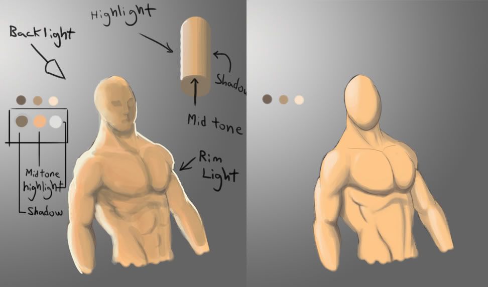
Since your suggested light is blue and coming from behind I am going to critique the image following that lighting scheme.
first of all you don't shade an image simply by lightening or darkening the color you are using. That flattens out your image. So pretty much no adding just white for highlights and no adding just black for shadows.
When you add highlights you light with the color moved closer to the color of your light. Since your light is blue I added the same color blue to the highlights. Usually you add a little bit of the light's complementary color (orange) for a safe shadow scheme. In this case though, I just cooled it down with the background color (another usual choice).
next. When your light is coming from behind there is going to be a rim light/ back light in most cases. It will be that thin edge of light you notice on the figure.
Highlights are automatically less saturated than your object because the light is casting a color onto its usual color. You seem to have that down here.
The shadows are overall lacking on your figure, and they too should be desaturated because no light is revealing them to us. Your area in shadow is too saturated. the most saturated area should be the mid tone (the area that is not overly lit or in shadow).
Hopefully this helps.
Overall this is rather good. I see you are using strokes at different opacities and already have a natural painterly approach. All very good.
Now for the crits.
Since your suggested light is blue and coming from behind I am going to critique the image following that lighting scheme.
first of all you don't shade an image simply by lightening or darkening the color you are using. That flattens out your image. So pretty much no adding just white for highlights and no adding just black for shadows.
When you add highlights you light with the color moved closer to the color of your light. Since your light is blue I added the same color blue to the highlights. Usually you add a little bit of the light's complementary color (orange) for a safe shadow scheme. In this case though, I just cooled it down with the background color (another usual choice).
next. When your light is coming from behind there is going to be a rim light/ back light in most cases. It will be that thin edge of light you notice on the figure.
Highlights are automatically less saturated than your object because the light is casting a color onto its usual color. You seem to have that down here.
The shadows are overall lacking on your figure, and they too should be desaturated because no light is revealing them to us. Your area in shadow is too saturated. the most saturated area should be the mid tone (the area that is not overly lit or in shadow).
Hopefully this helps.
Here you go then. http://i272.photobucket.com/albums/.....y137/bloop.jpg

Comments