 FA+
FA+
442
Views
Views
16
Favorites
Favorites
Category
All / All
Species Unspecified / Any
Size 800 x 1035
File Size 247.7 kB
Report this content
More from Saara

")
")


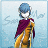
Formatting the art for an 8 1/2 by 11 cover meant creating a lot of filler. Stretching wouldn't do. I created a background in a neutral colour (it may look very familiar to FA members), then softened it with repetitive text. The fanzines main title went over that. The white border was left so that the art can be xeroxed without fading off the edge of the page.
Category All / All
Species Unspecified / Any
Size 800 x 1035px
File Size 247.7 kB

Slick composition! For about three years, I had the great misfortune of wanting to become a Graphic Designer. I can't imagine doing nothing but composing other people's art on the page without being able to do it myself. I am glad that I have slipped from that strangling field. Still though, being able to put things like this together may come in handy. What are you using to put your images together? CS1 Photoshop or something different? Perhaps Paint.NET?

Comments