 FA+
FA+
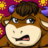
1037
Views
Views
26
Favorites
Favorites
Category
Artwork (Traditional) / General Furry Art
Species Hyena
Size 1024 x 785
File Size 250.6 kB
Report this content
More from KV1NN4


Urgh! I need to find a better way to fill in large areas of black on any given picture because my marker obviously wasn't up to the task. XT
(looks a little better irl but not by much...)
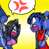
Commissioned by darrenzeraus who I hope forgives the blue hair - this was the result of, according to my husband, my information pertaining to basketball players being about a decade old if not more. ^.^;
I mean.. they still team up with Scooby-Doo and Bugs Bunny on a regular basis.. right? Right??
(looks a little better irl but not by much...)
Commissioned by
 darrenzeraus who I hope forgives the blue hair - this was the result of, according to my husband, my information pertaining to basketball players being about a decade old if not more. ^.^;
I mean.. they still team up with Scooby-Doo and Bugs Bunny on a regular basis.. right? Right??
Category Artwork (Traditional) / General Furry Art
Species Hyena
Size 1024 x 785px
File Size 250.6 kB


And now we have the Dennis Rodman of the FBA. XD The question is, was it ice blue yesterday?
Awesome pic!! Love that cool attitude on Sharp's face, and the hard black-white background works really well with the pic. And I have to add, that lettering is AWESOME. Great style there!
Awesome pic!! Love that cool attitude on Sharp's face, and the hard black-white background works really well with the pic. And I have to add, that lettering is AWESOME. Great style there!
Oh, I disagree. I think you can take plenty of credit for the lettering. And here's why--
- Smart choice of font! The serifs make it look like text from a book, making it feel more like a story than an industrial sign or an advertisement. I like that a lot, because then the words really connect with the character-- the words aren't about him, they're from him. The quotes prove that grammatically, but the font choice gives it more impulse. Even further, the fact that the serifs are so fat and simple and the lettering has that grungy pattern makes it look hand-printed, like it was stamped old-school style from a manual press. That's hot. That just connects it even more to the character, almost as if he put the words on the page.
- The ALL CAPS is great. In e-mails, we think of that as shouting. Here, it's more intensity. He's not just saying the words. He's snarling them.
- Making the words LAUGHING and CRYING just a little bit bigger is brilliant. It's so subtle, you almost don't realize it at first, but those two words have more punch than the others. Also super smart to have put those words on their own lines, and make them the ONLY words on their own lines.
- The slight shift in leading of the letters is genius. Again, further connects the words to the character, hinting at the idea he put them on the page. Those aren't some machine printer's words, those are stamped by the same brown paw holding that basketball.
So, yeah. That's what I meant by your lettering being AWESOME.

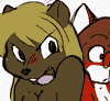
What can I say? Nutty bunny is nutty.
Which is completely redundant. One of those adjectives should be removed.
What can I say?Nutty bunny is nutty.
Much better. See, using the same word twice in the same sentence reduces the impact. This way, the word has more punch when you read it. You're not giving away the conclusion of the sentence with the first word, but challenging the reader to finish the sentence to reach that final idea. Now reading it is much more fulfilling, because you conclude the idea at the same time as when you finish reading it.
.
.
.
.
.
What?
Which is completely redundant. One of those adjectives should be removed.
What can I say?
Much better. See, using the same word twice in the same sentence reduces the impact. This way, the word has more punch when you read it. You're not giving away the conclusion of the sentence with the first word, but challenging the reader to finish the sentence to reach that final idea. Now reading it is much more fulfilling, because you conclude the idea at the same time as when you finish reading it.
.
.
.
.
.
What?


Comments