 FA+
FA+
1540
Views
Views
26
Favorites
Favorites
Category
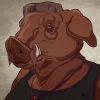
Artwork (Traditional) / Bondage
Species Bear (Other)
Size 700 x 540
File Size 116.4 kB


Comments