 FA+
FA+
1988
Views
Views
227
Favorites
Favorites
Category
Artwork (Digital) / Fantasy
Species Western Dragon
Size 1280 x 640
File Size 526.8 kB
Report this content
★
More from Chromamancer


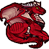
This is another picture that I spent a lot of time on. It was made around three months ago. I tried to put a bit more detail into the wings. This is also a good example of what it can look like when I use lines to show a few major scales, and a texture for the rest.
I also tried to contrast eh warm foreground colors with the cooler background colors, as well.
I also tried to contrast eh warm foreground colors with the cooler background colors, as well.
Category Artwork (Digital) / Fantasy
Species Western Dragon
Size 1280 x 640px
File Size 526.8 kB
Ask away! :D
I'll do my best to answer. So, just ask again if you want me to clarify any part of this.
In this picture, the coloring was done with three separate layers. Two gradient maps, and one layer where I brushed on some color manually.
Gradient maps apply colors to parts of a picture based on the grayscale brightness value. http://www.photoradar.com/technique.....-gradient-maps
The explanation may not make too much sense, if you've never used them before, so if you're not familiar with gradient maps, I would play around with them a bit. Photoshop can make them quite easily, and I think GIMP can too, but I haven't tried that one.
Anyway, first, I made the entire picture in grayscale before applying colors. This made it easier to focus on getting the lighting and contrast right.
Then, I made a gradient map layer with some blue and purple tones. This was used to color the sky and several parts of the background. After that, I made a contrasting gradient map with some lighter oranges and yellows. I used a layer mask to apply this gradient map to only the areas where I wanted it. Such as the dragon, and bright areas in the background.
Finally, I brushed a few colors on by hand, such as the blue eye, and the gray horns and claws.
When I make a picture in Photoshop like this one, coloring is usually the last thing I do.
I make the whole thing in grayscale, then play around with colors until I find a color scheme that looks right.
This is probably the most helpful thing I can show, as far as those go. It's the process behind my Forest Depths picture.
http://chromamancer.deviantart.com/.....cess-151931982
That was before I learned about gradient maps. I found out about them in the comments on there, actually.
The process I followed to make the grayscale image is the same, though.
Basically, I make a sketch, and go over it to make line art.
Then, I use some solid color fills to get started shading, and add in the rest of the detail gradually.
Then, keep practicing.
I've had that reaction to plenty of art before. I certainly couldn't make art like this, even a year ago.
Whenever I see something like that, I always try to see if I can figure out how it was made, and what sorts of techniques the artist uses. Also, there are some awesome tutorials around that can be very helpful. Basically, if you continue to learn and grow as an artist, then perhaps you can inspire people some day.
That's what I hope to do.

I couldn't do what I'm doing last year, and I do agree that practice does make everything. I still have a long way to go.
Usually when I have that reaction, I'm much like you, I want to see if I can figure out how you did it. You're very good, and I'm in awe of what you can do. I'm eager to see where you'll go from here
Usually when I have that reaction, I'm much like you, I want to see if I can figure out how you did it. You're very good, and I'm in awe of what you can do. I'm eager to see where you'll go from here


Comments